SHADOW HOUSING
2020 / Housing / Los Angeles, CA / 20,000 SF
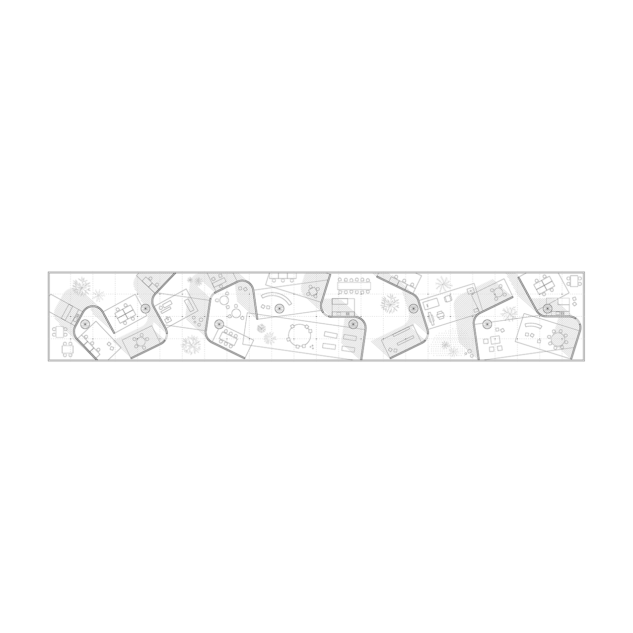
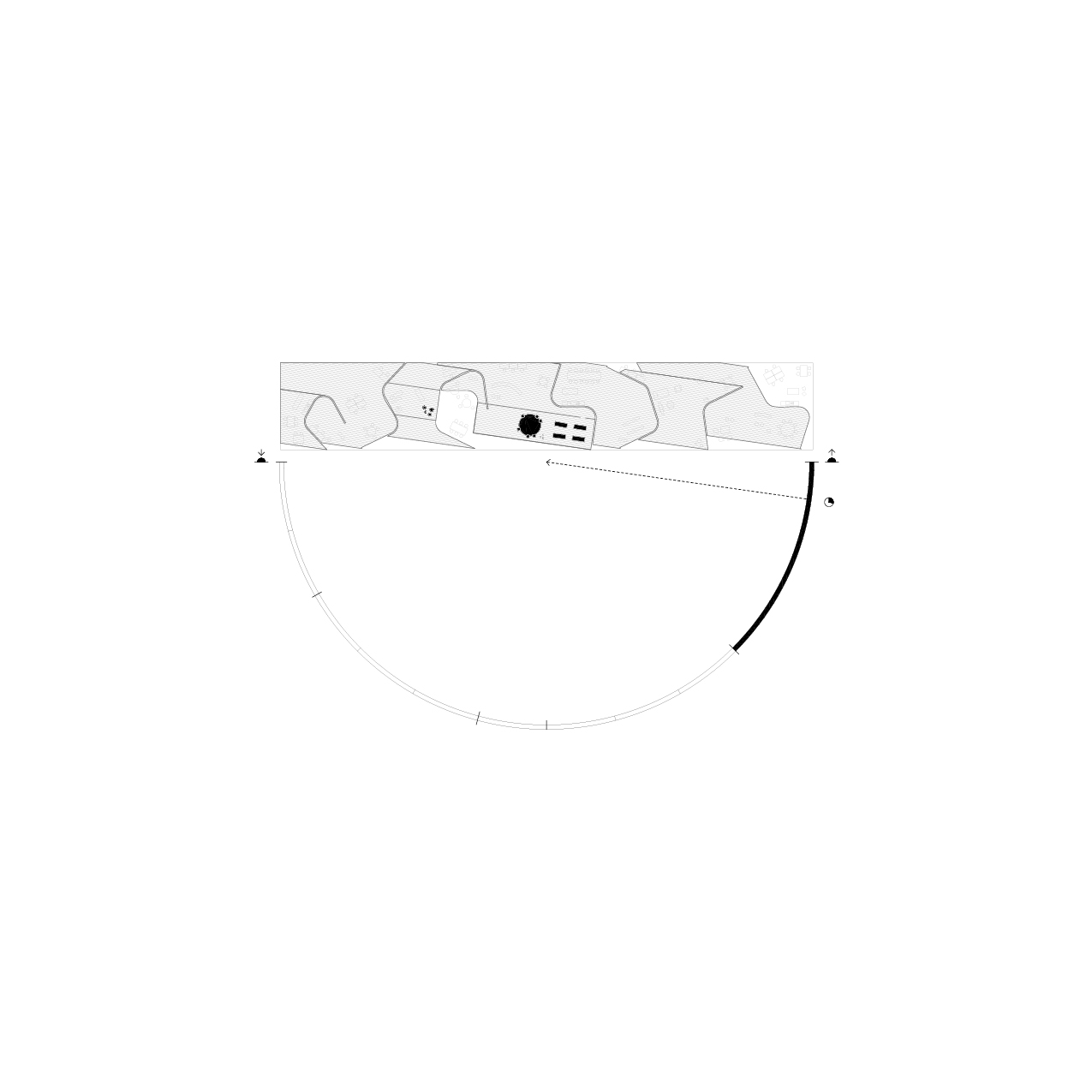
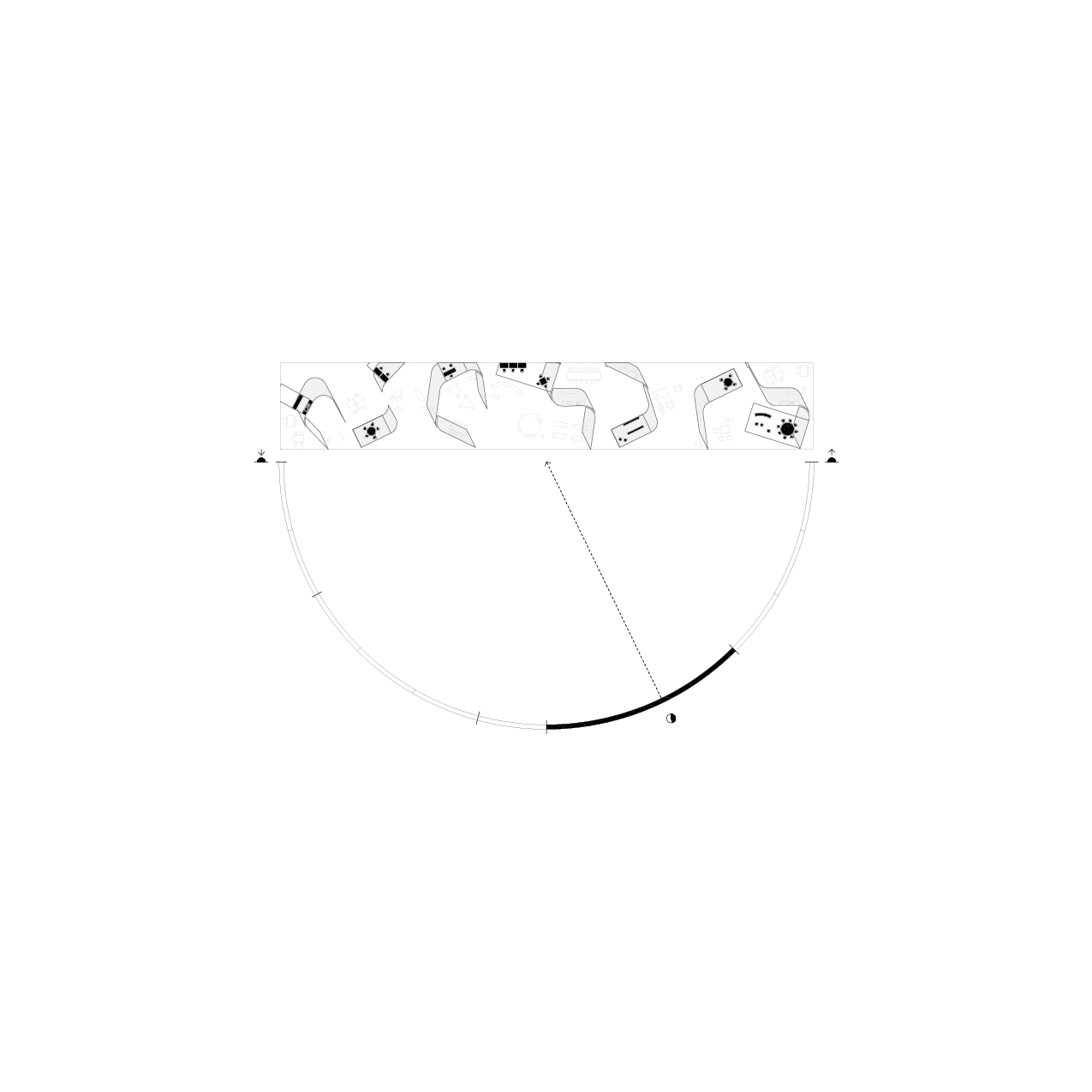
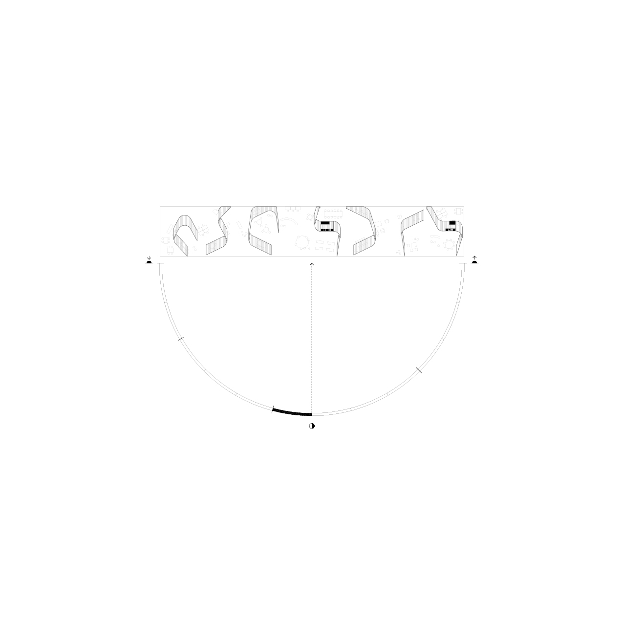
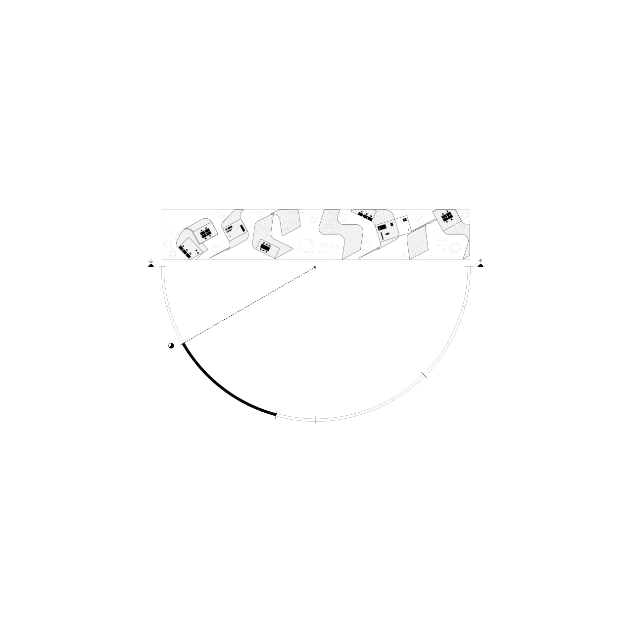
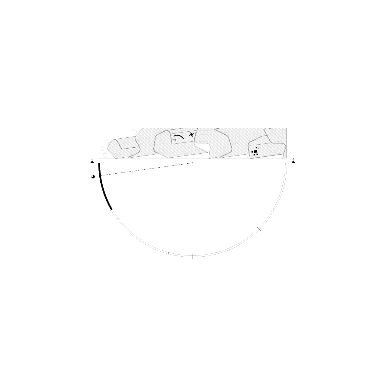
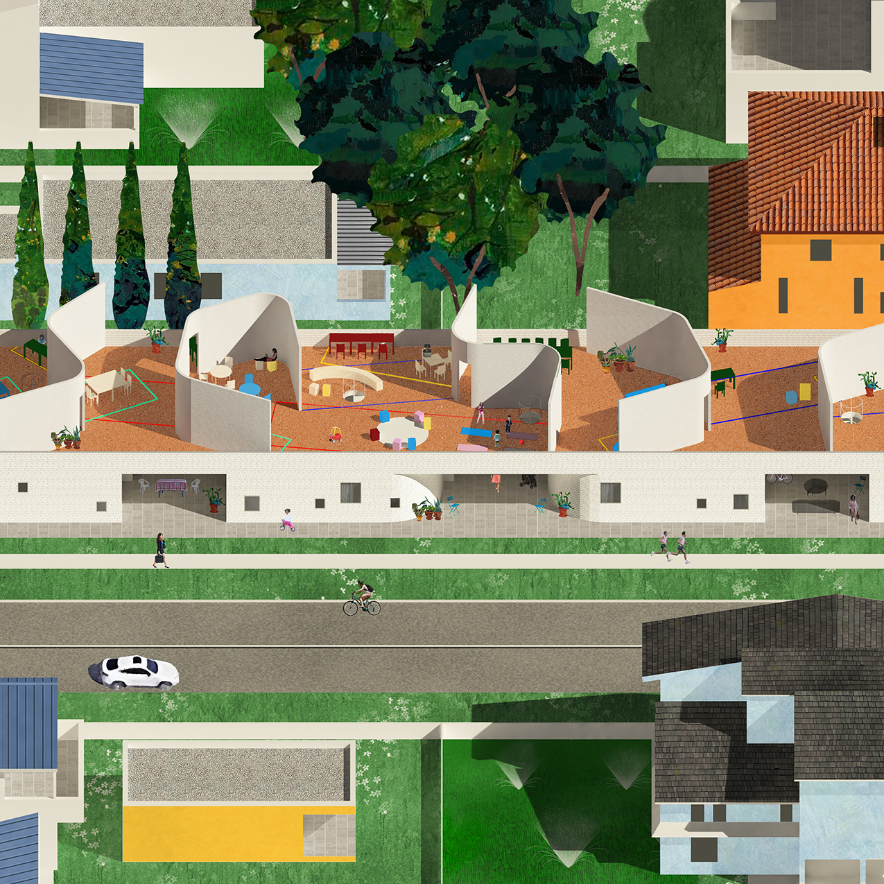
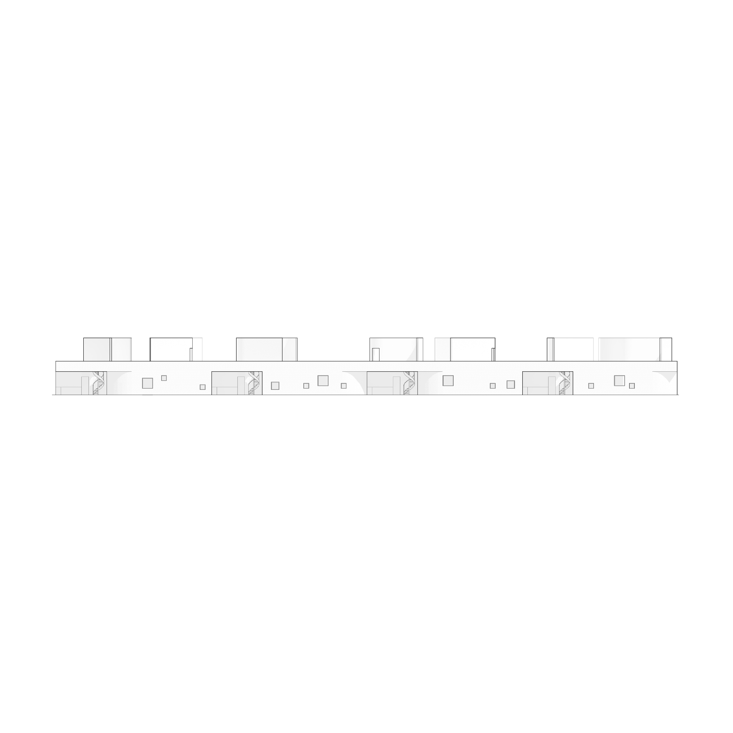
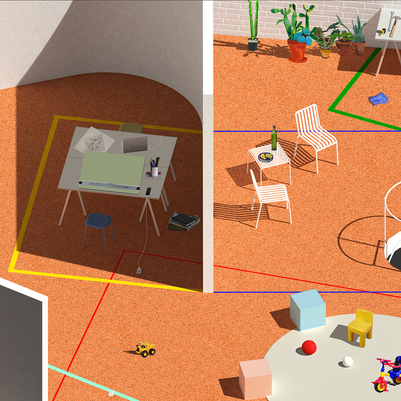
Shadow Housing is a model for collective living in a post-pandemic era: an open-air live/work commons that configures new domestic schedules of work and care through an architecture of light and shadows. As COVID-19 ruptures the boundary between the office and the home, the available time for domestic labor such as cooking or childcare is being subsumed by a “flexible” expanded workday. While the eight hour workday reflects an abstracted “clock time” coextensive with the capitalist emphasis on productive labor over unwaged housework, Shadow Housing embodies a natural time that tethers the workday to the movement of the sun, establishing a spatial and temporal separation between work and the necessary labor of care. In moving from an immaterial/universal timekeeping to a physical form of timekeeping dictated by the sun, Shadow Housing spatializes time to resist the blurring of working and living, and reestablishes the circadian rituals of the home. Situated in the temperate, arid climate of central Los Angeles, Shadow Housing proposes a pandemic-safe form of outdoor co-living where daily activity alternates between periods of work and shared domestic labor as directed by shadow and sunlight. Above a ground floor of enclosed private units and semi-enclosed patio rooms shared by two units, the rooftop common space is composed from a series of walls angled to cast shadows, forming shaded outdoor rooms for work and collective care at designated times of day. Demarcated by lines that approximate the average shadow length and angle at the specified time of day, these spaces shift in and out of alignment with the casted shadows according to their scheduled time of use within a reconstituted workday.
Care Office
Design Research
Overall Winner, HOME Competition 2020
Published in ArchDaily, Archinect, and designboom




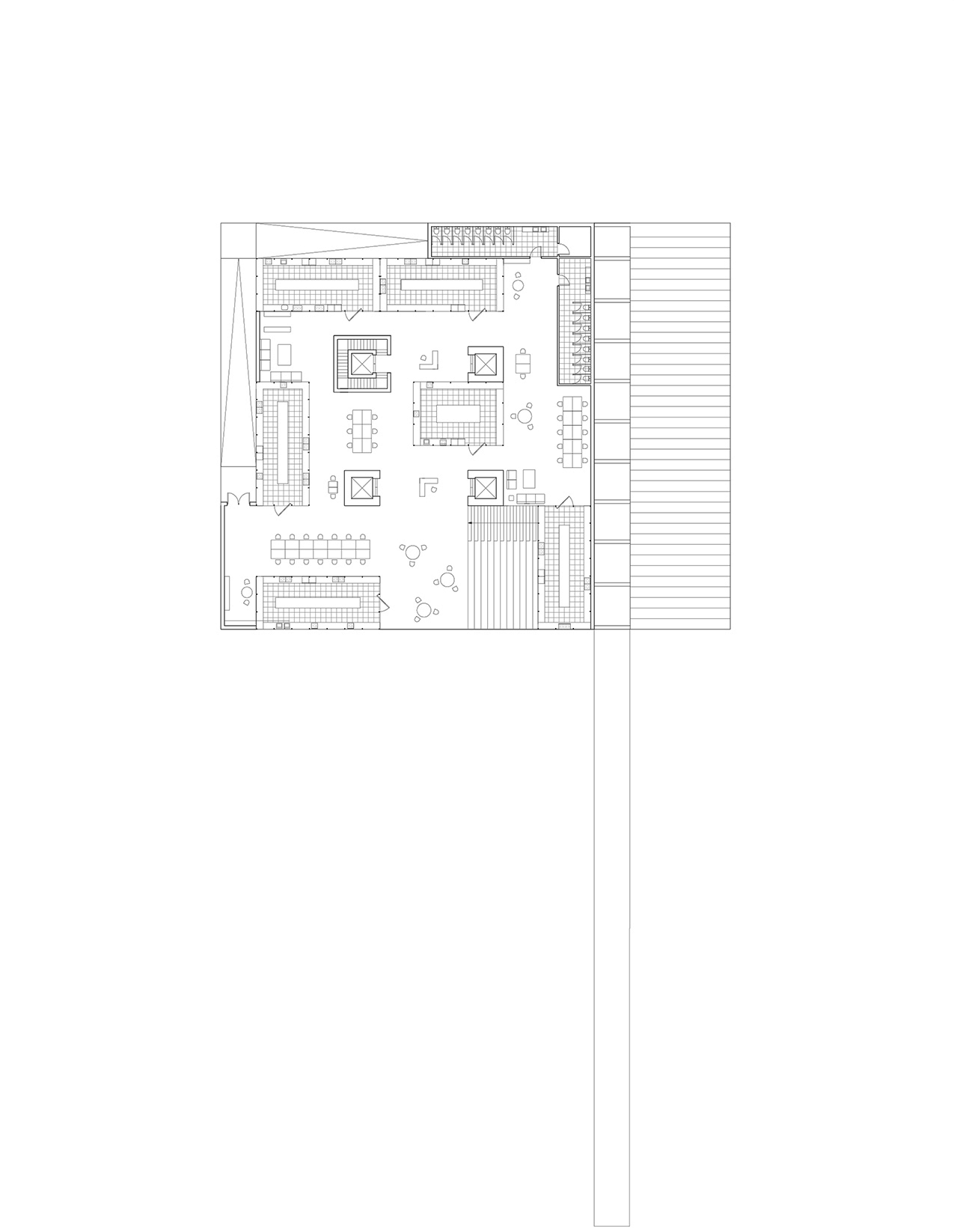
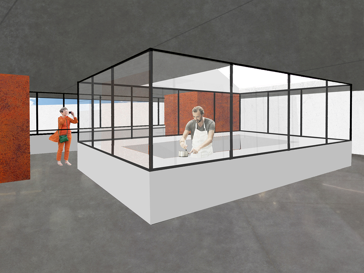
AGGREGATE OFFICE
2023 / Office / San Francisco, CA / 25,000 SF
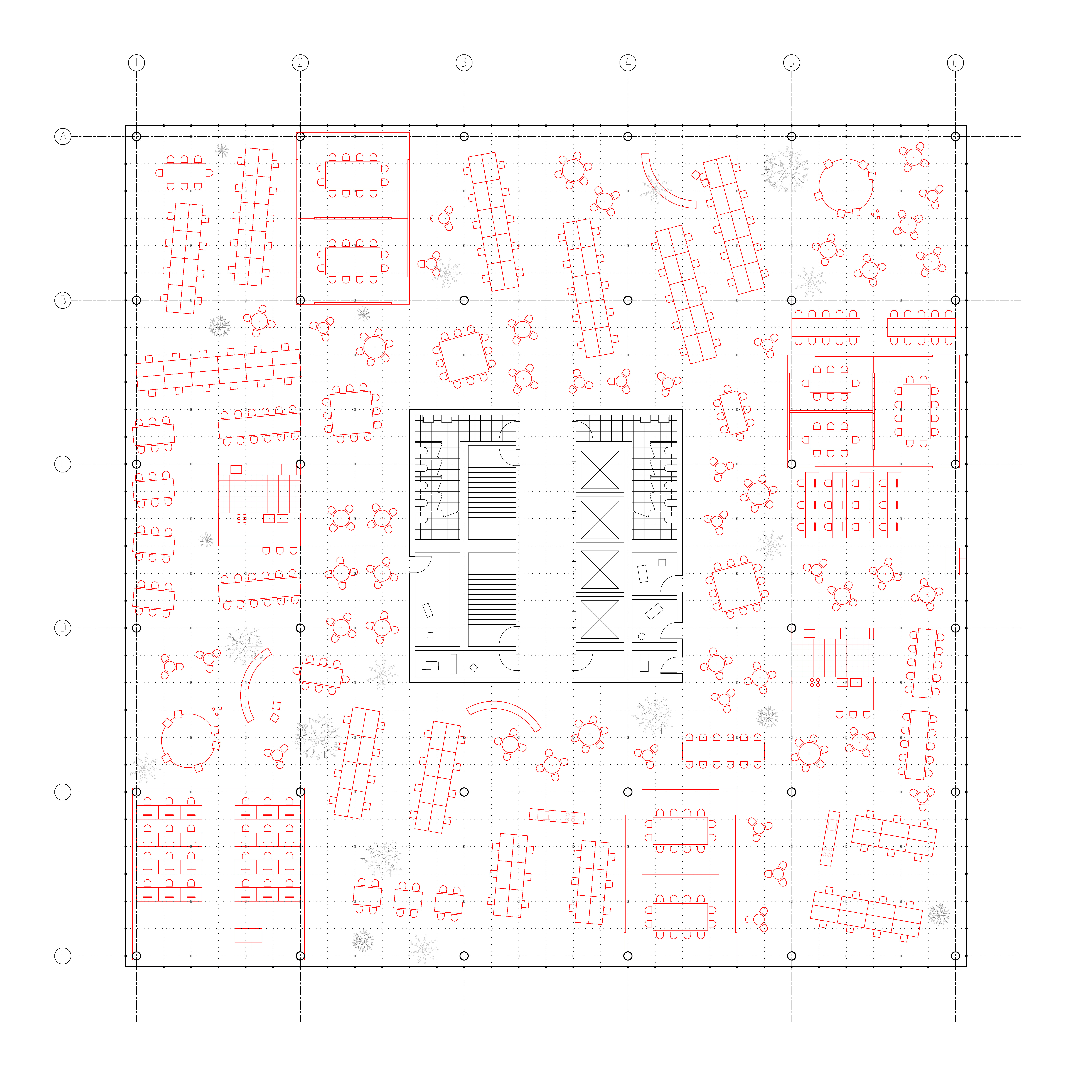
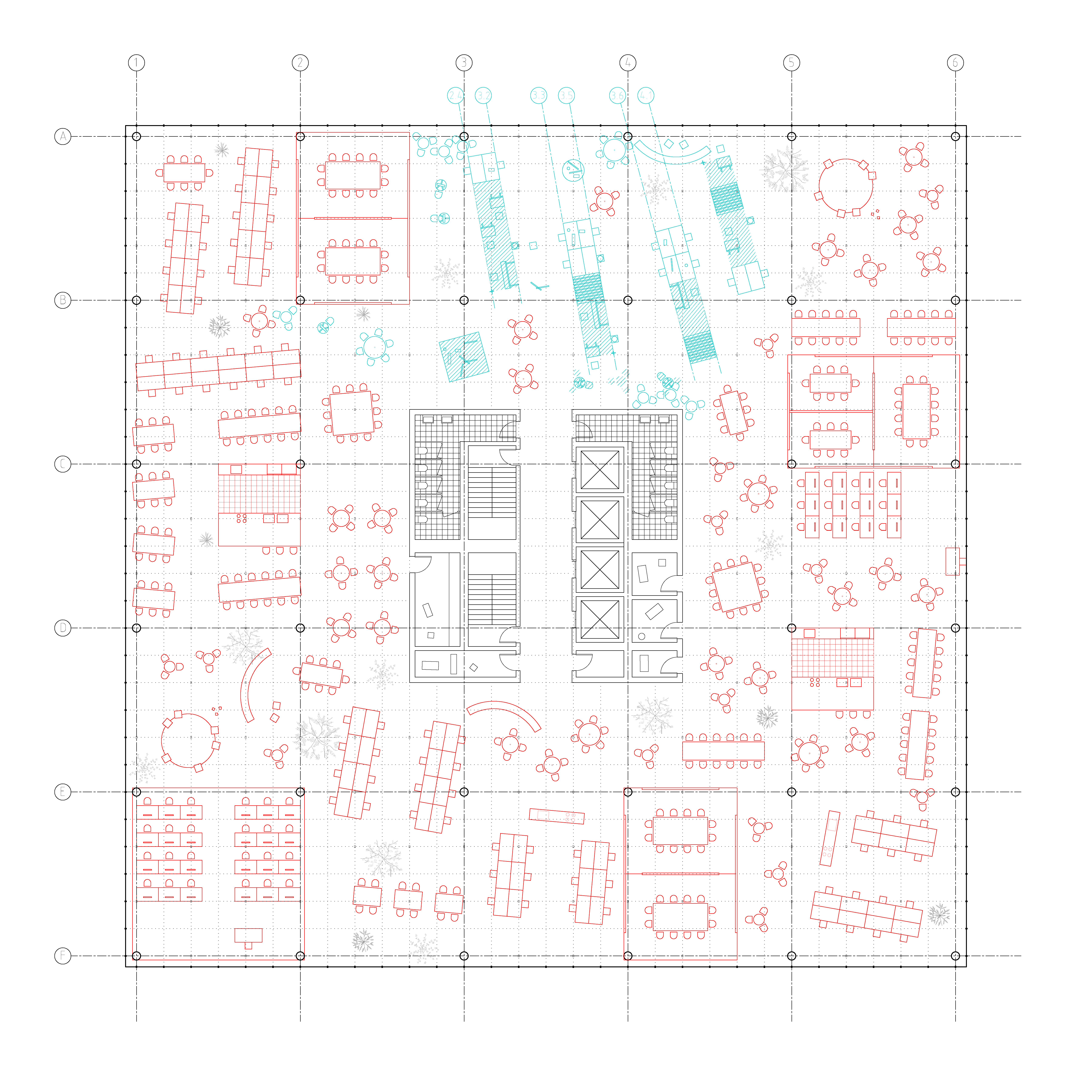
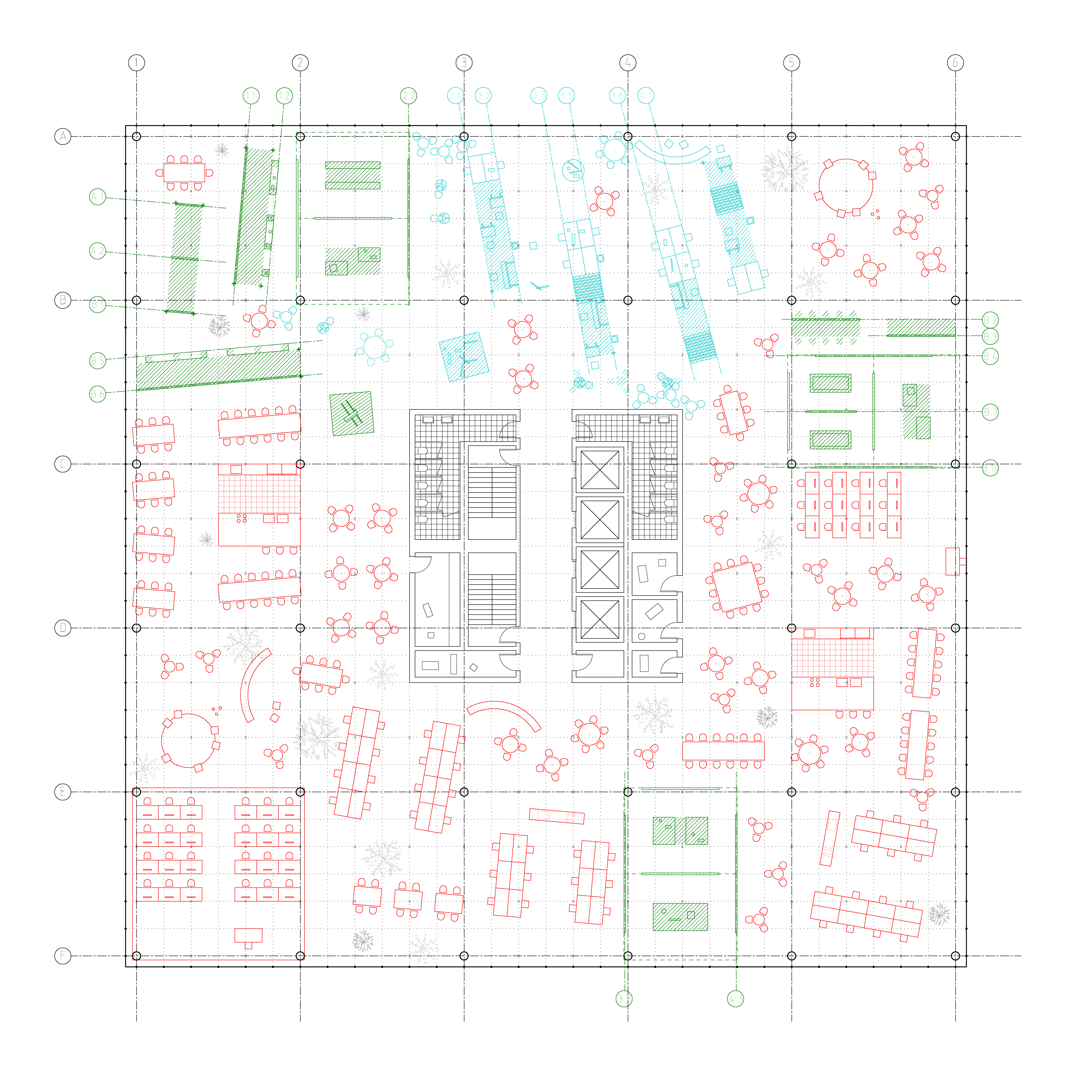
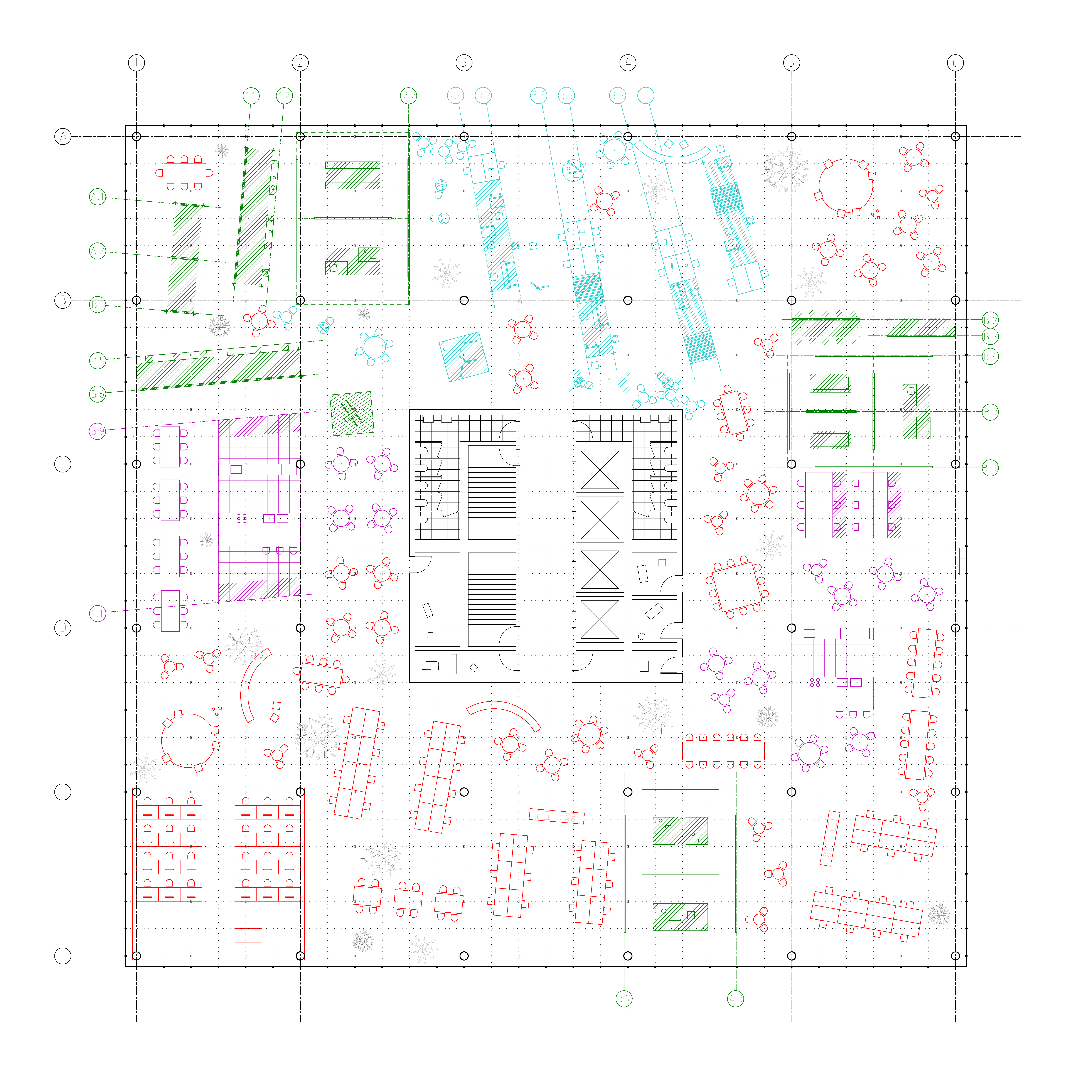
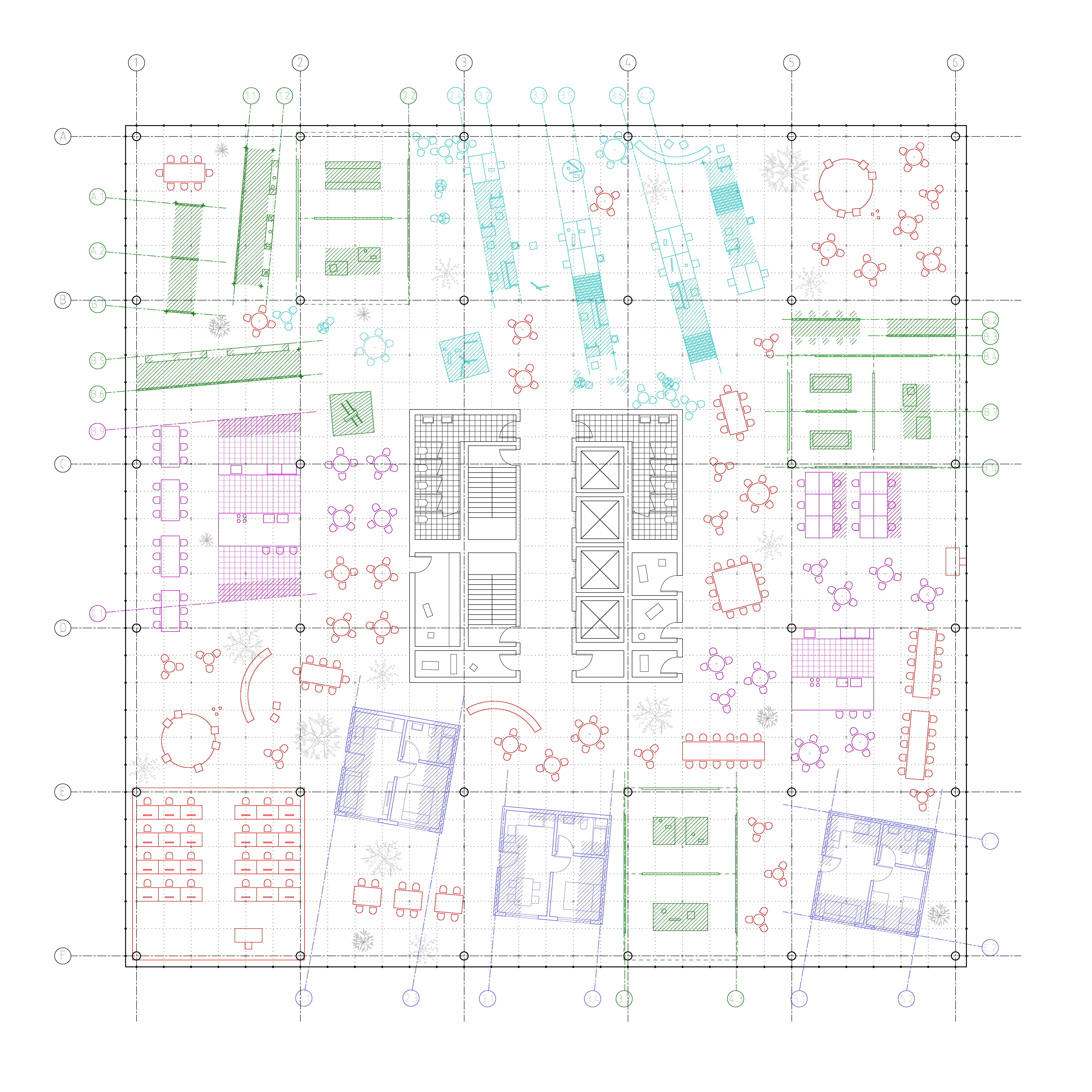
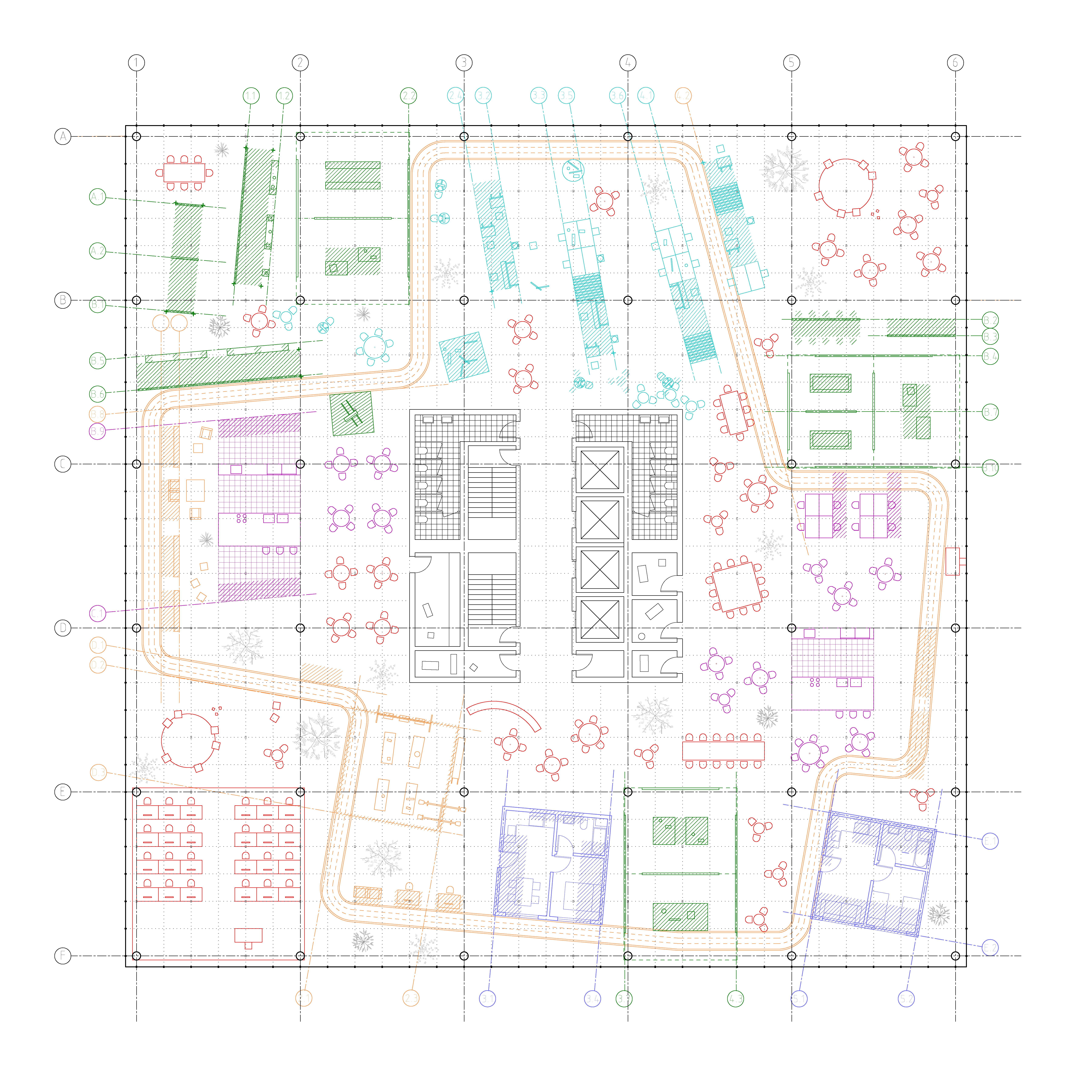
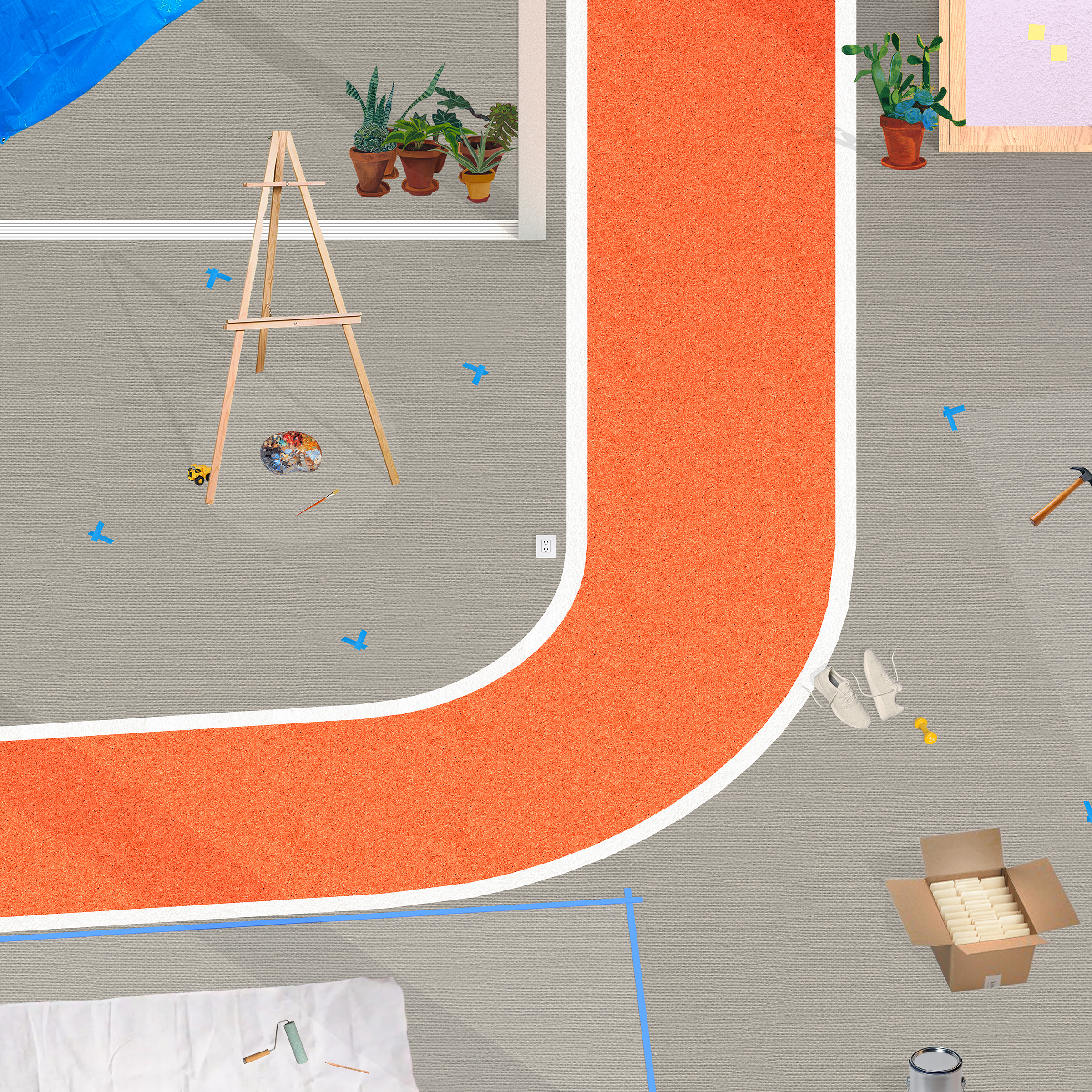
Economic transformations and shifting paradigms of work have rendered the office building increasingly obsolete. Emerging models of hybrid and remote working have left office spaces vacant in downtown areas across the country. Unable to adapt to the changing urban conditions spurred by new models of working, the office building is at risk of becoming a defunct typology. While contemporary efforts to convert office space into usable programs such as housing have stalled due to the daunting scale of retrofitting spaces of vast expansiveness, Aggregate Office imagines the adaptive reuse of a typical office plan through incremental shifts that appropriate the residues of past uses for new functions. The project posits that spatial transformation occurs through the embrace of architectural residues rather than their erasure. The desire for blankness has relegated the office building to perpetual emptiness, remaining vacant and unable to adapt to urban change. Conversely, architecture that reflects the residues of past histories can create the conditions for its future reappropriation. Drawing upon the generative potential of mark-making, this project initiates a process of adaptive reuse in which each additional program builds upon the imprints of previous uses, imposing successive layers of residue that aggregate into an architectural palimpsest. The project mines the productive potential of architectural remnants to generate a programmatically diverse interior urbanism out of the office’s void, establishing a paradigm of work as a public and social practice intertwined with leisure. Aggregate Office remakes the architecture of the workplace to reflect increasingly transient and mobile paradigms of labor. Due to the prevalence of hybrid, remote, and gig-based freelance jobs, work has been largely transplanted from dedicated workplaces in downtown areas into domestic spaces as well as other public spaces and businesses in the city. Ultimately, Aggregate Office intersperses spaces for work and leisure throughout its open floor, imagining work as an urban, social activity integrated with the essential public activities and experiences of the city.
Care Office
Design Research
Published in POOL 8: Residue

WOVEN VEIL
2023 / Memorial / Los Angeles, CA
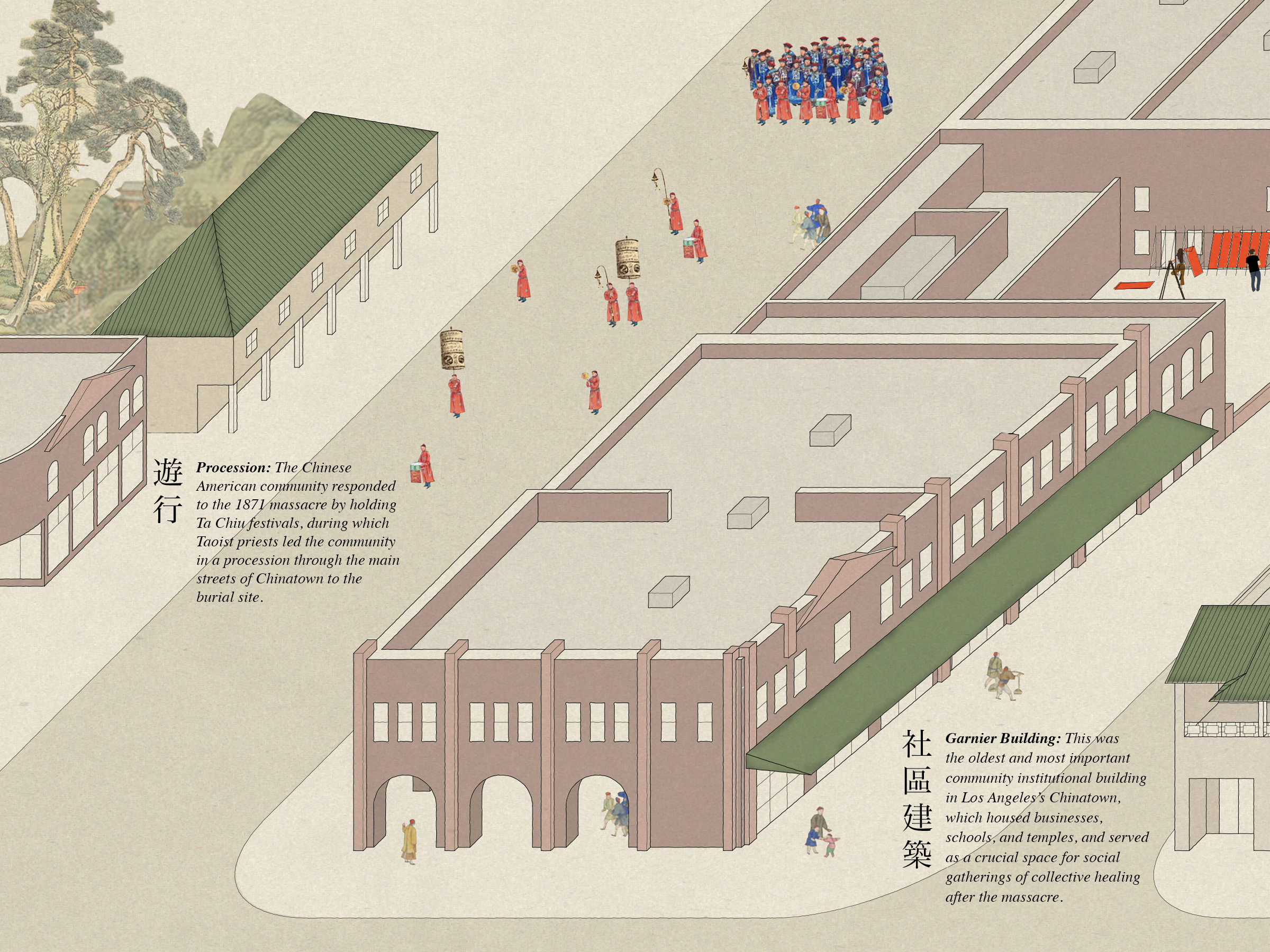
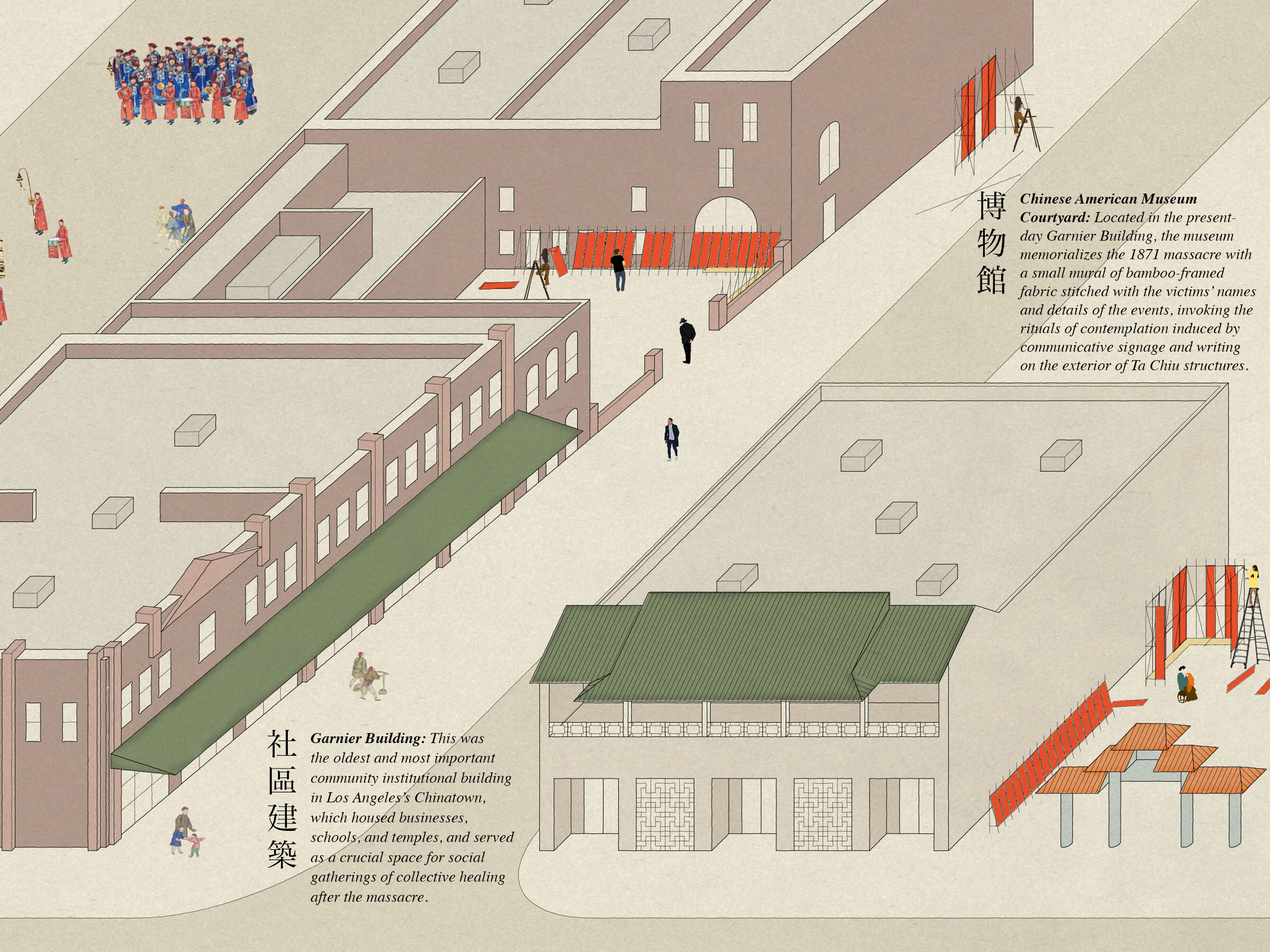
The Taoist festival of Ta Chiu 打醮 is a spiritual rite of collective building that uses architecture to facilitate the healing of cultural trauma. From 1872 to 1908, the Chinese American community of Los Angeles held yearly Ta Chiu festivals to mourn the lives lost to the 1871 Chinese Massacre. Taoists celebrate Ta Chiu by assembling temporary shrines that serve as the bridge between the divine and earthly worlds. These shrines allow the public to commune with the spirits of the deceased and establish harmony between the realms. The Los Angeles manifestations of Ta Chiu in particular were staged to restore peace to the victims of the massacre and realign the community with the path of the Tao. Woven Veil 團結 is a set of collaboratively built structures that invites individuals from the Los Angeles Chinatown community to participate in Ta Chiu rituals that memorialize historic tragedies and recent anti-Asian hate crimes. The modularity of Woven Veil’s construction allows the memorial to take on various configurations that reflect three of the historic functions of the Los Angeles Ta Chiu festivals: contemplation, gathering, and procession. This project is presented using the Chinese narrative form of the handscroll. Often reflecting Taoist ideals of a unifying trajectory throughout past, present, and future, handscrolls present stories through text and drawings imposed onto a continuous roll of paper or silk, unrolling to reveal a gradual progression of events unfolding in time and space. Woven Veil’s narrative scroll is split into sections depicting the past, present, and future of Ta Chiu in Los Angeles. Mining the double meaning of the divine as both a divine entity and a ritual of divining the future, Woven Veil proposes Ta Chiu as a spiritual practice of imagining historical and future narratives, allowing residents of Los Angeles’s Chinatown to craft the stories of their cultural past to inform the present conditions of the community, and to envision future possibilities.
Care Office
Competition Entry for 1871 Chinese Massacre Memorial
Published in PLAT 12: Divine



DINGBAT COURT
2021 / Housing / Los Angeles, CA / 12,000 SF
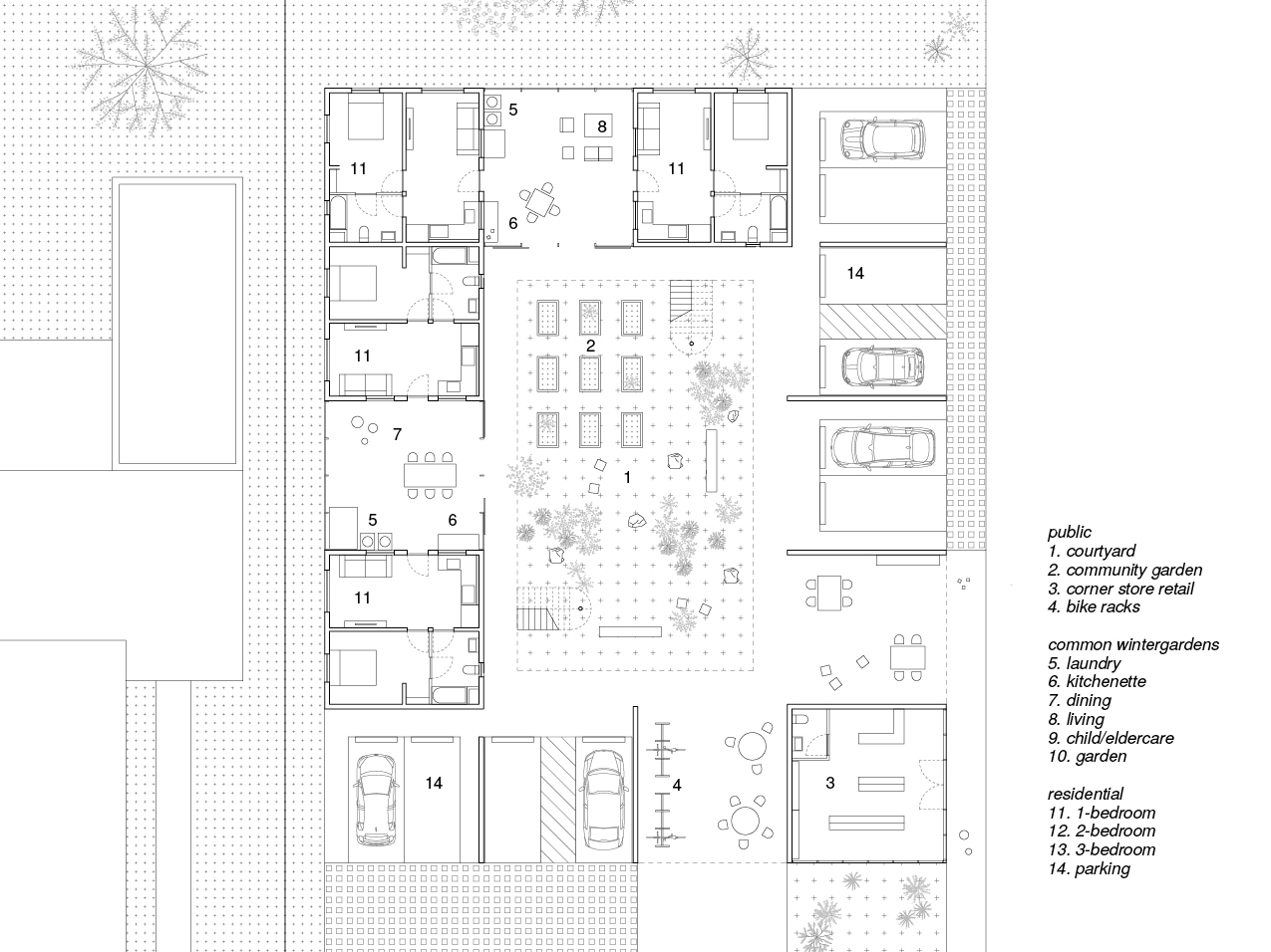
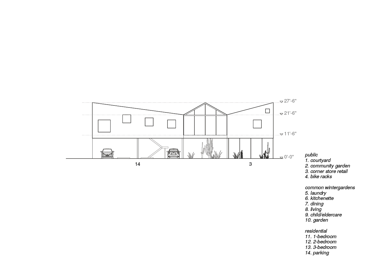
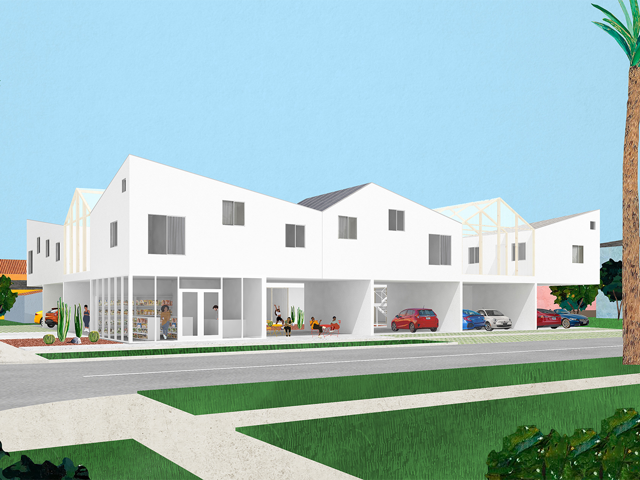
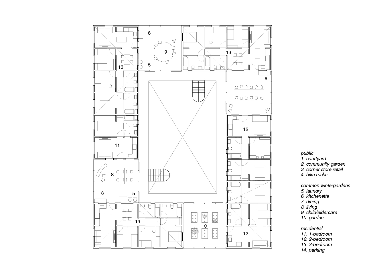
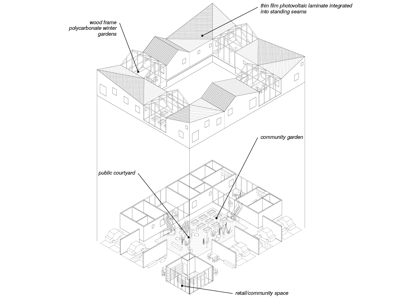
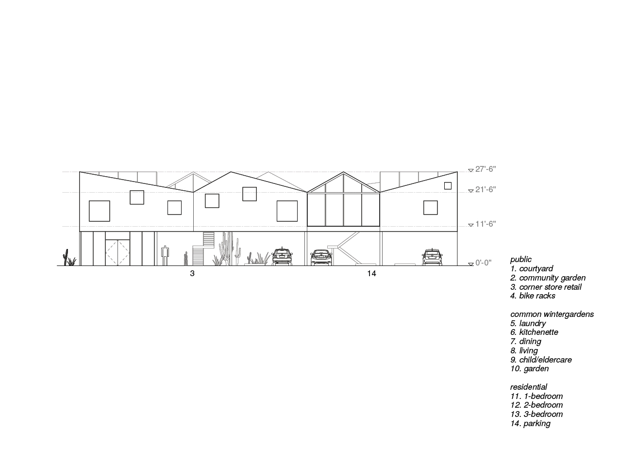
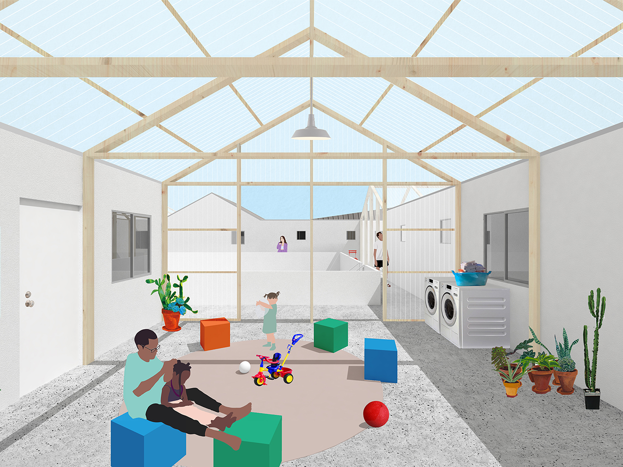
Drawing from the dingbat’s structure in elevating living spaces to create useable covered space below, as well as the bungalow court’s spatial arrangement of units around a central courtyard, Dingbat Court is an affordable housing model that combines and reinvents both typologies for communal living while establishing public space for neighborhood use. The building’s structurally open ground floor centers around a public courtyard for outdoor gathering and community gardening. The street-facing sides of the building provide shaded public space, residential parking, and a small-scale retail space at the corner, creating a porous edge for public engagement at the street level. Thus, Dingbat Court’s porous street facades bring the public into the center of the building, while accessible residential units occupy the non-street facing edges of the ground floor. Sited on a combined lot at the corner of two streets, the building creates a new public space for the neighborhood to gather and engage in small-scale food production. The elevated second level reflects the spatial composition of the bungalow court: two duplexes and two freestanding units organized around a central void. While these four bungalow units remain separate from one another, they are connected by semi-enclosed “wintergarden” spaces of wood-framed polycarbonate. These unconditioned wintergardens allocate expanded areas for communal food production, care, and housework without the increased cost of additional enclosure. Located at the shared entry between individual units, these wintergardens provide space for mutual aid where residents can grow vegetables together, care for each other’s children and elders, and share duties for cooking and laundry, lessening each family’s individual burden of reproductive labor.
Care Office
Competition Entry for Low-Rise: Housing Ideas for Los Angeles
Published in FRAME 141




SETTLEMENT OF DIFFUSE HOMES
2019 / Housing / Albuccione, IT
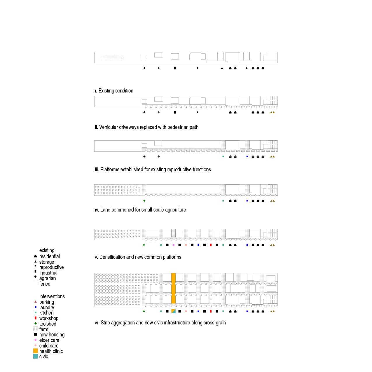
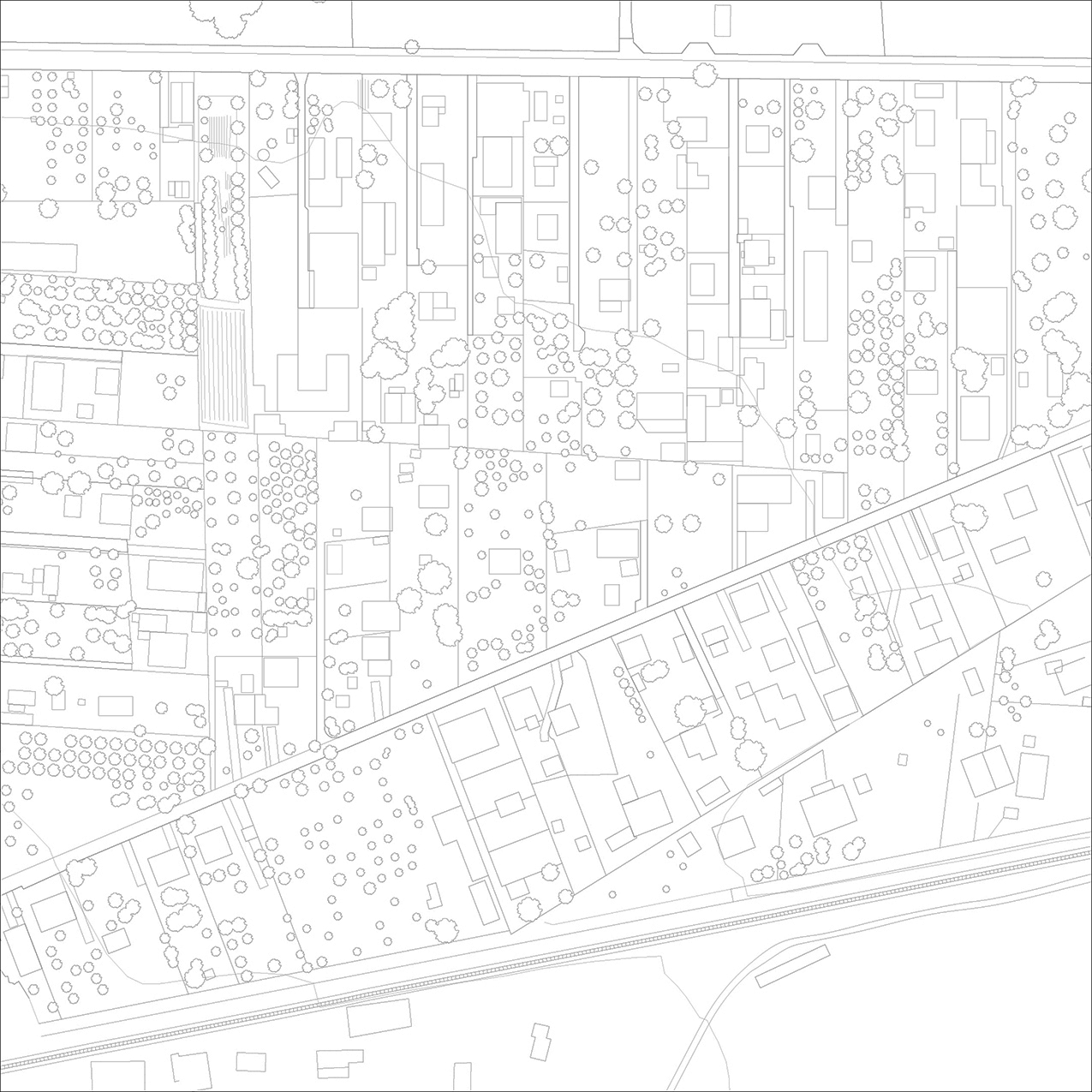
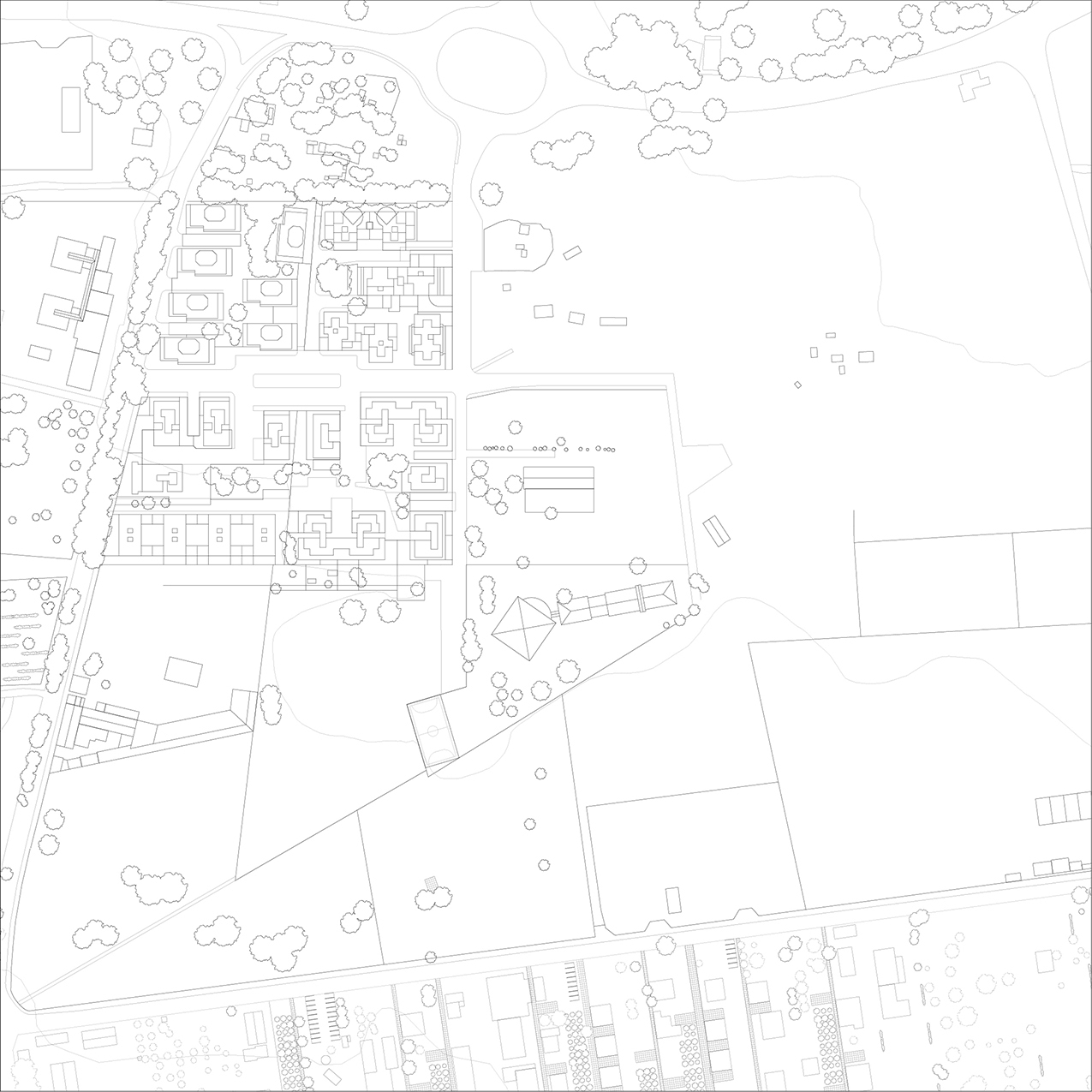
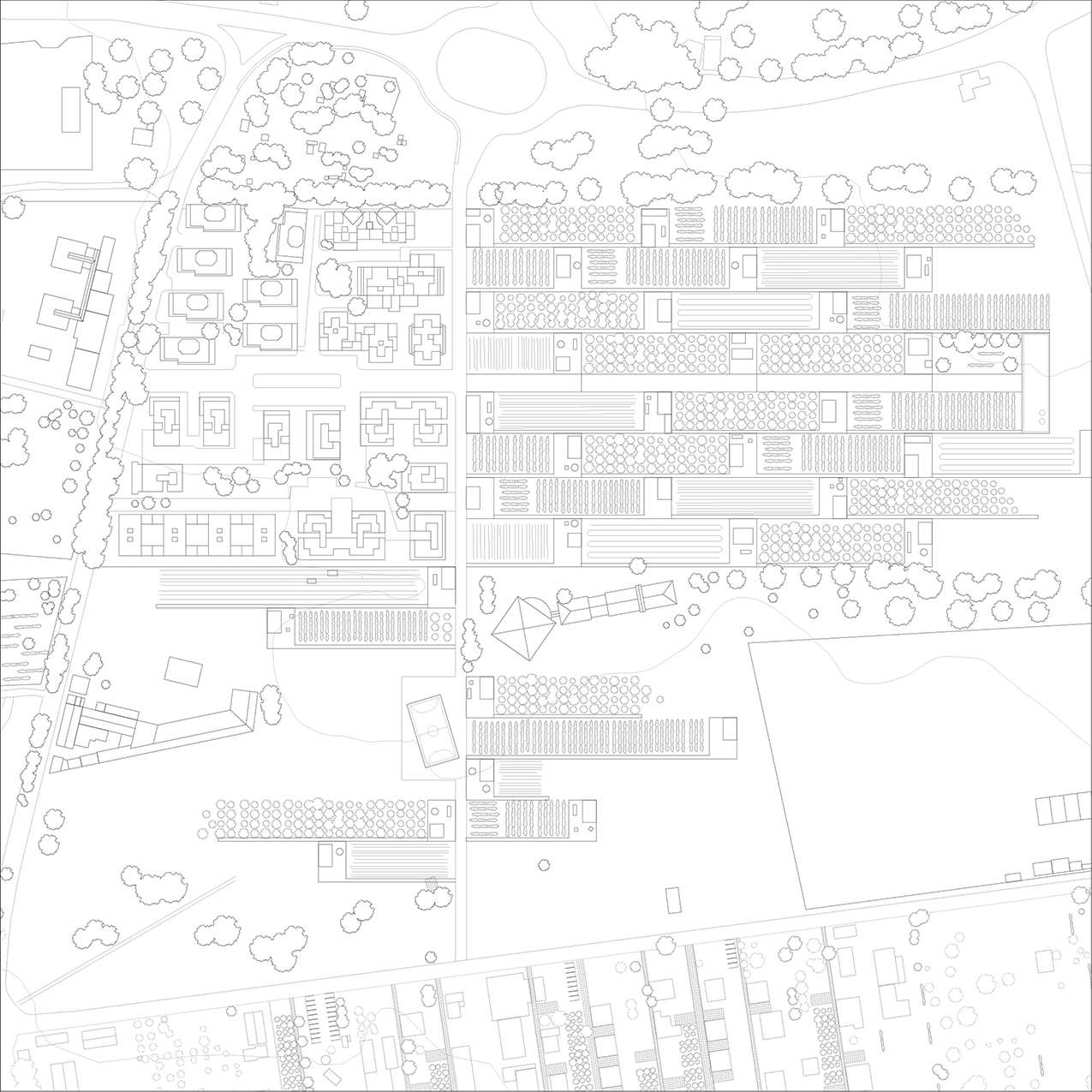
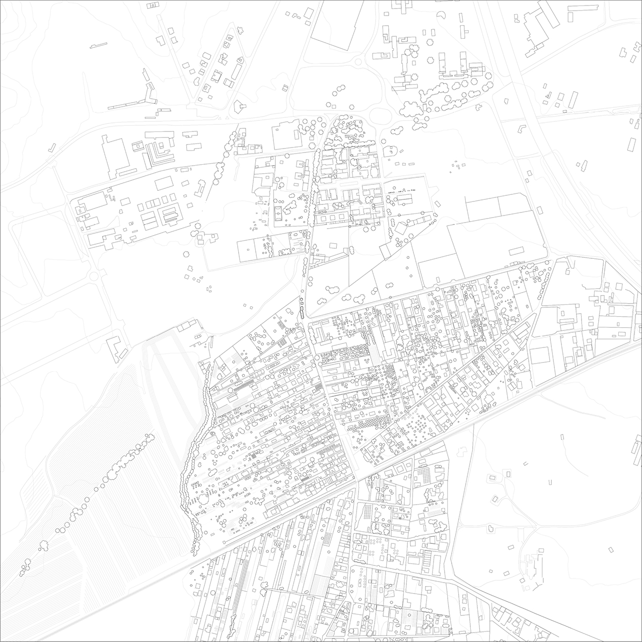
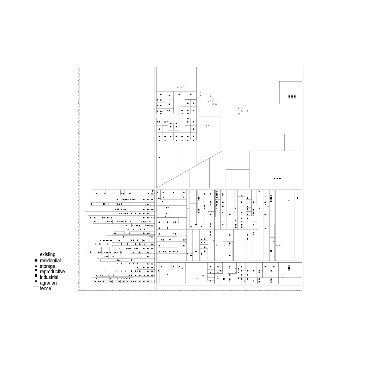
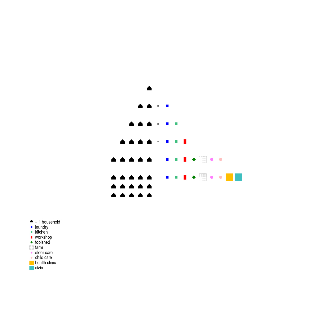
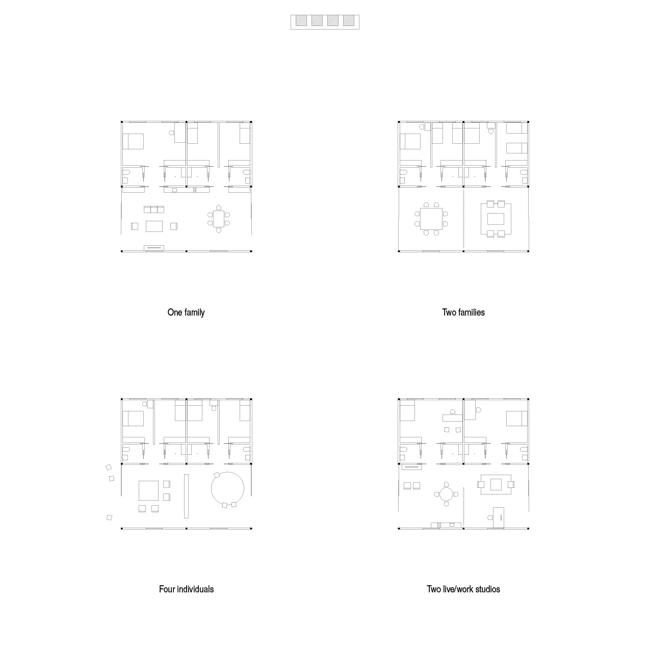
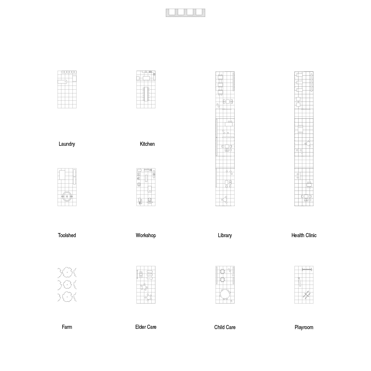
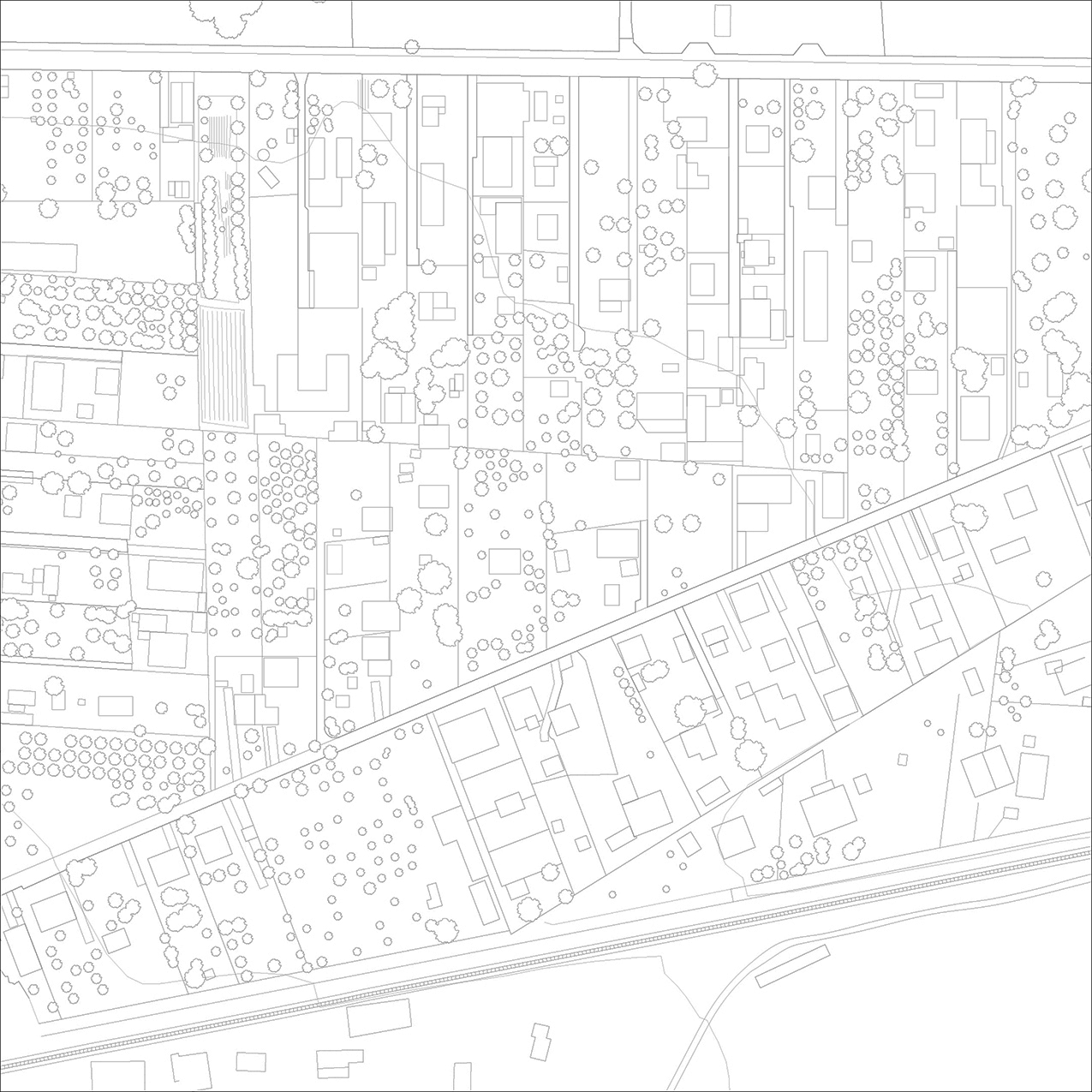
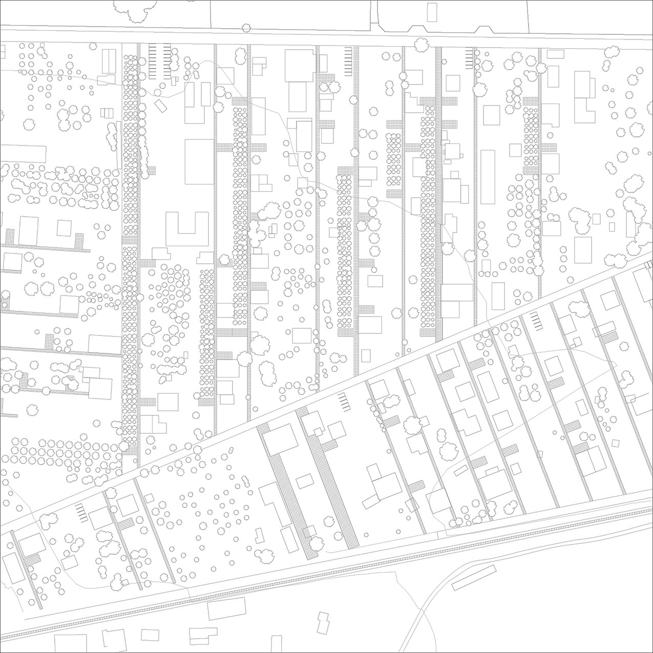
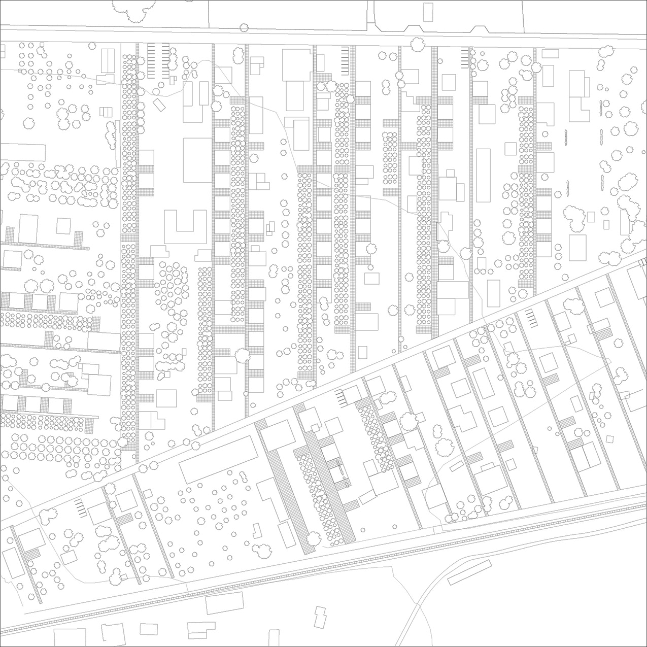
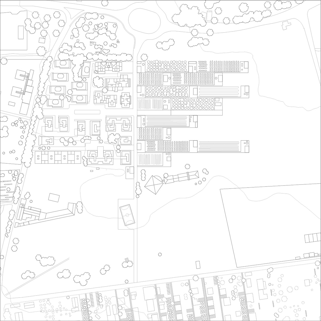
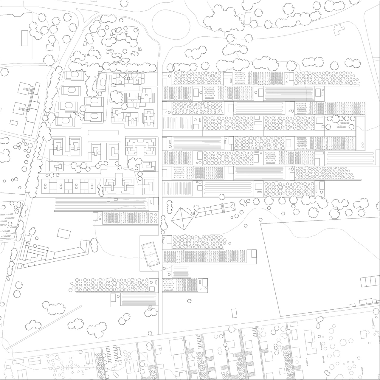
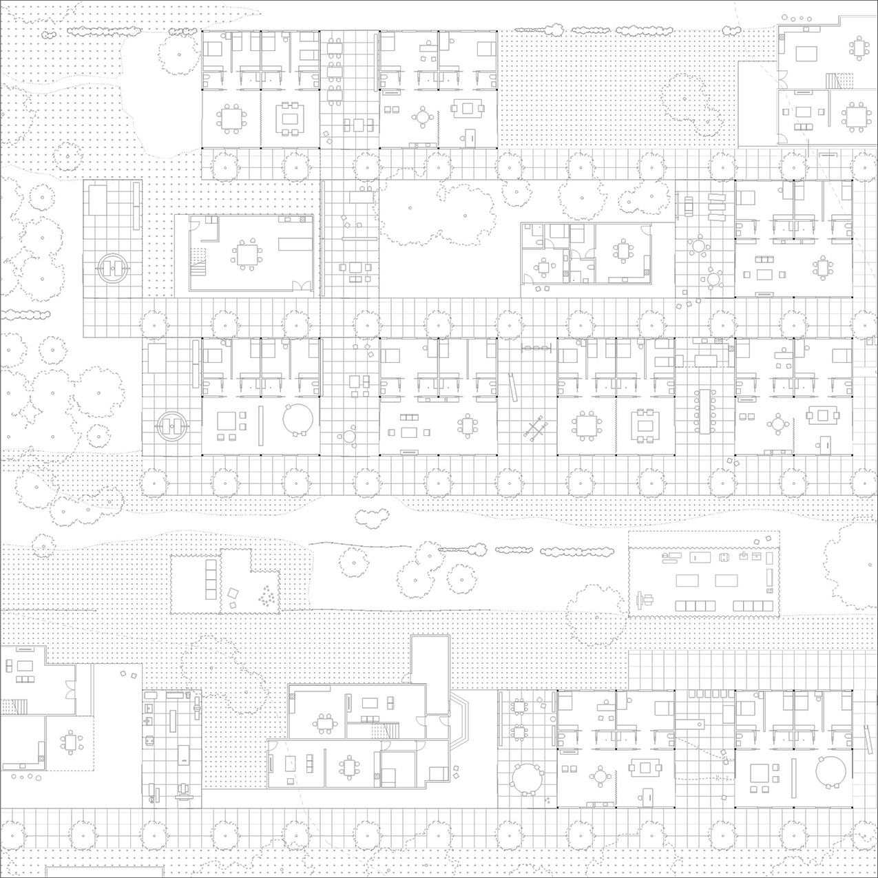
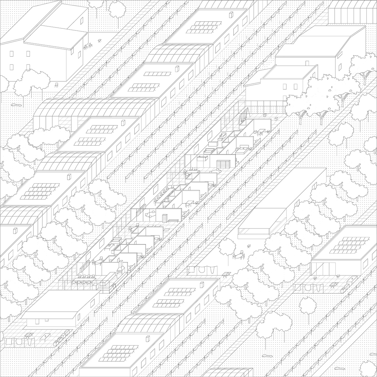
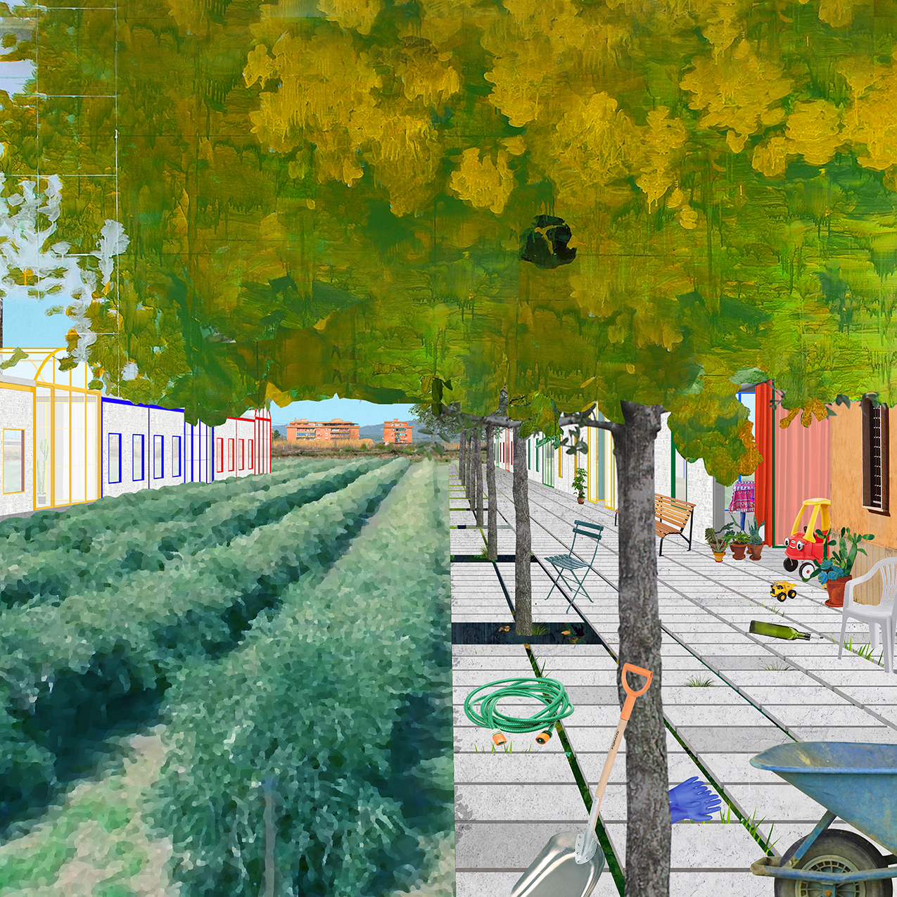
Built in the late 1980s by the municipality of Guidonia Montecelio in the north-east Roman Agro, Albuccione was one of the last social housing projects to be built in Rome, in an era when the government used social housing to train residents for private homeownership rather than advocate for communal forms of living. To the south of this social housing are two informal communities where settlement has occurred along slender, linear agrarian fields. The physical constraint of the linear lots and the lack of infrastructure for these settlements have forced residents to build informal secondary structures to perform labor that their primary residence cannot accommodate. Thus, Albuccione is a settlement where the household has been disassembled into various elements, scattered across the site, and reconstituted in diffuse form. With a third of its population over the age of 65 and an even greater number forced to partially dwell in shoddily-built structures, Albuccione is facing a crisis of care. However problematic in its current state, this deconstructed condition of domesticity also presents an opportunity to reinvent reproductive labor as a shared public ritual rather than one belonging to the private domestic sphere. This project reconstitutes the household as a linear strip of collective rooms for the commoning of reproductive labor and care. The project first implements a “comb” structure of platforms along a linear path, which provides common space between existing homes for shared domestic activity. This subdivision provides structure for densification through a new model of communal housing: single-story assisted living units with communal spaces where residents care for one another and engage in shared agricultural and industrial production. Though this process of commoning operates as a ground-up protocol, beginning with the agreement between individual families to share basic domestic resources and labor, it can eventually reorganize the structure of each settlement as a whole according to the logic of communal care and provide the settlement with a legible infrastructure for new communal rituals of domesticity.
M.Arch I Advanced Studio / Critics: Pier Vittorio Aureli, Emily Abruzzo
In collaboration with Haylie Chan
Published in Wasteland and Retrospecta 42









LIVING THEATER
2017 / Transportation + Market + Office / Bronx, NY / 40,000 SF
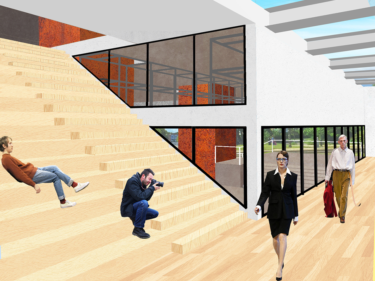
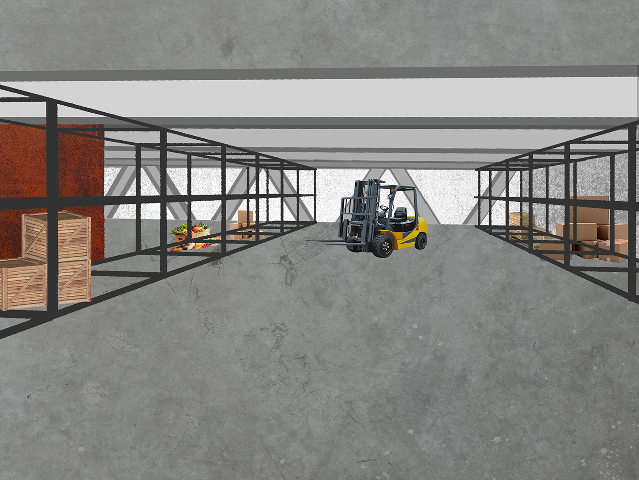
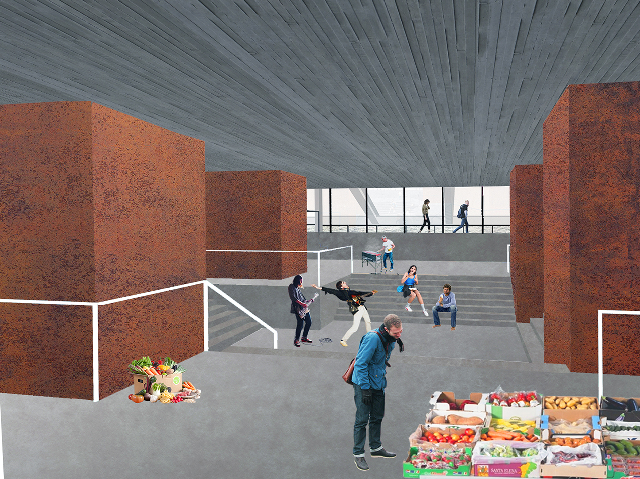
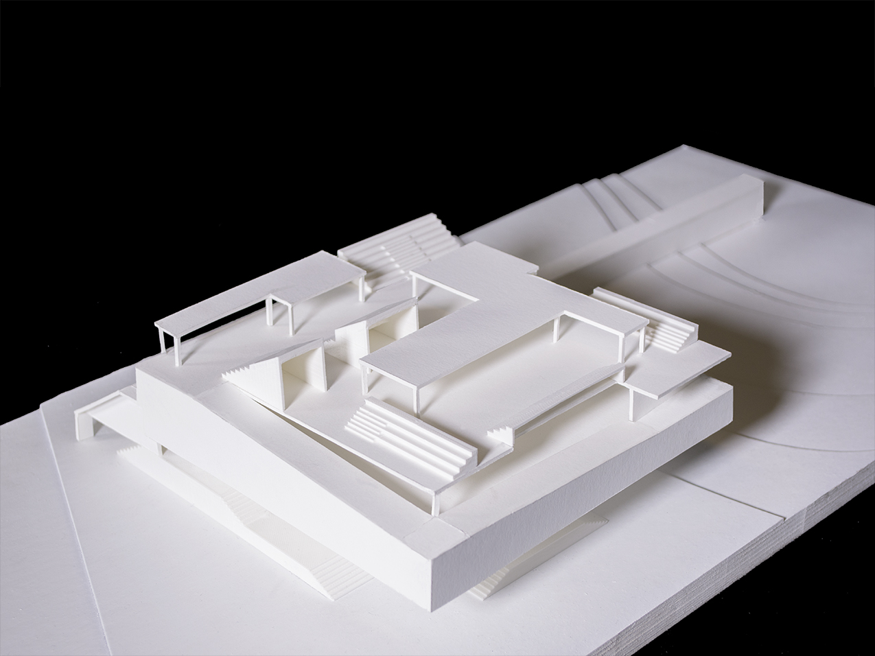
As a ferry terminal, kitchen incubator, and marketplace for Clason Point, Living Theater turns a nexus of physical and commercial exchange into a space of performance and spectatorship. Living Theater posits public space as a theater of everyday life. The building constructs moments of performative action and spectatorship primarily through sectional differentiation: employing flat platforms as stages while raised steps serve as seating for observation. The tectonic form of the building allows for this sectional denotation of performance/spectatorship. The building is an elevated mass that rests on four structural and circulatory cores. This structural system enables an unobstructed free plan that is transformed into a free section. In raising the warehouse and kitchen incubator/co-working space, the ground beneath the building becomes a public plaza. The ground level is an open array of platforms and stairs that double as stages and seating, respectively. The platforms directly under the building become a covered marketplace and open social space for impromptu events and performances, while the eastern edge of the ground floor serves as the ferry terminal boarding area. Within the building mass itself, the plan remains open to enable visual continuity and fluidity in moving between areas of performance and spectatorship. Despite the openness of the plan and section, however, Living Theater is not a neutral container for events, but employs the specific constraints of architectural form to influence user activity towards the performative. As a building that turns everyday event into theater, narrative fiction is not only an important means of representation but also a generative tool for design. These narratives scripts dictate an experiential procession in which users undergo fluid shifts between performing and spectating, vignettes which then become physicalized as built form; thus, the building becomes the physical artifact of the narratives it generates.
M.Arch I Third Semester Studio / Critic: Emily Abruzzo
Published in Retrospecta 41
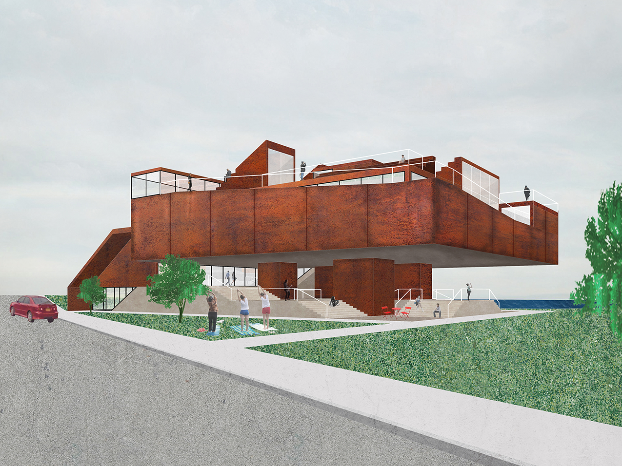


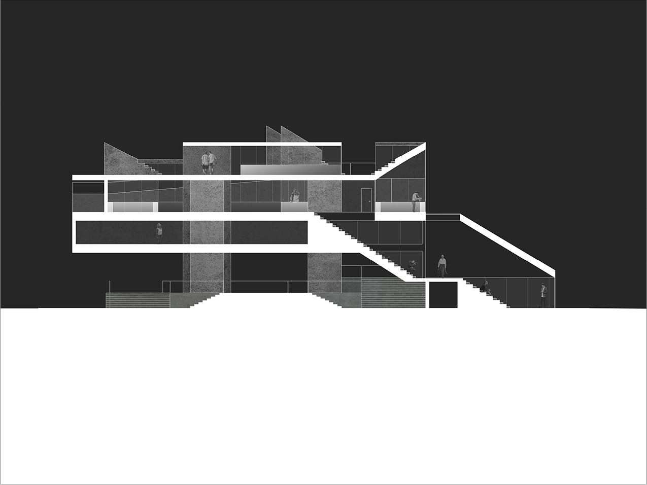
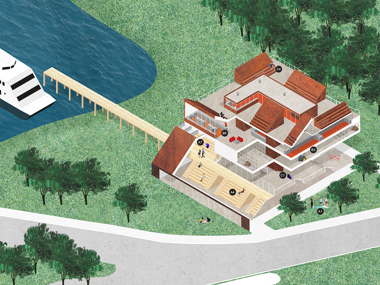


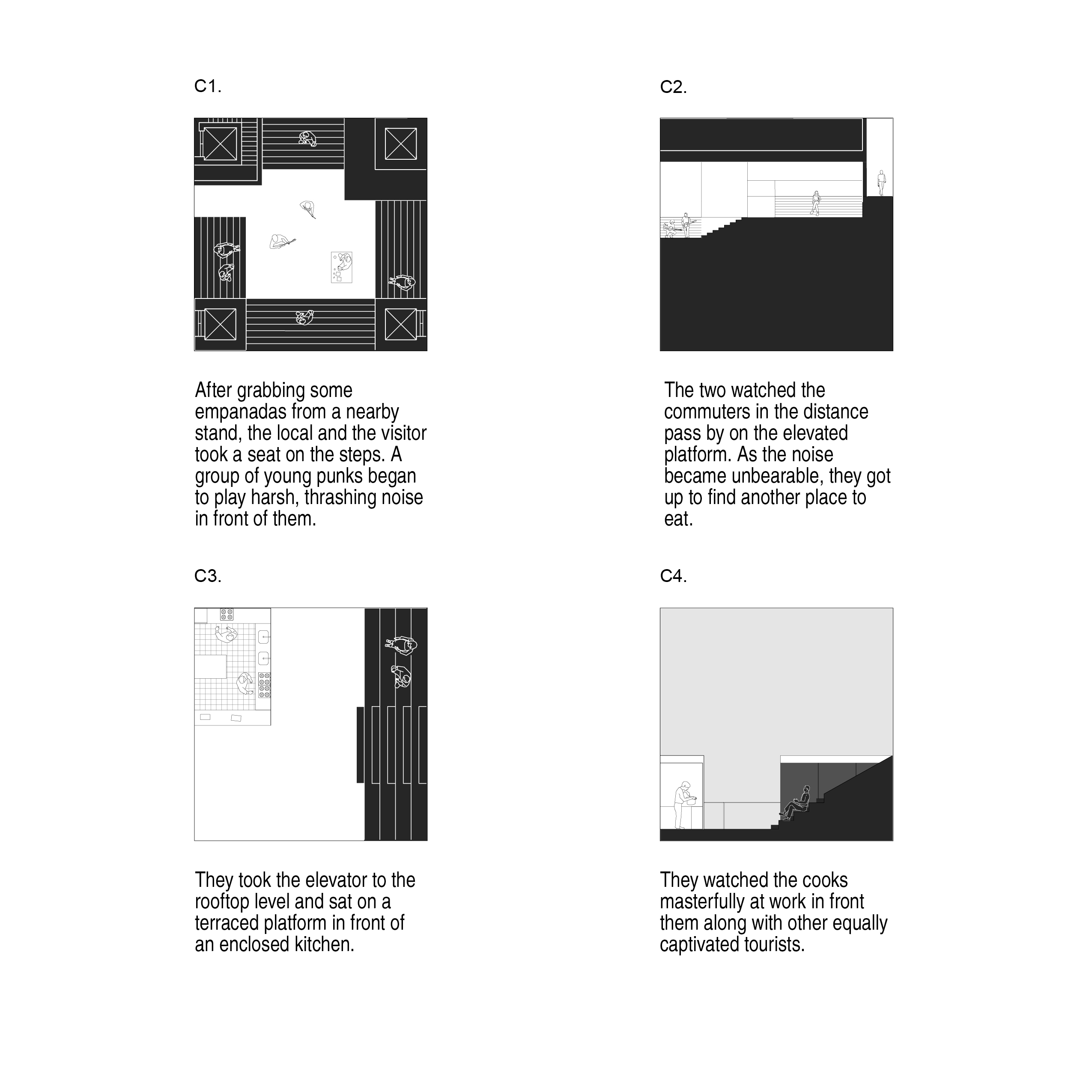


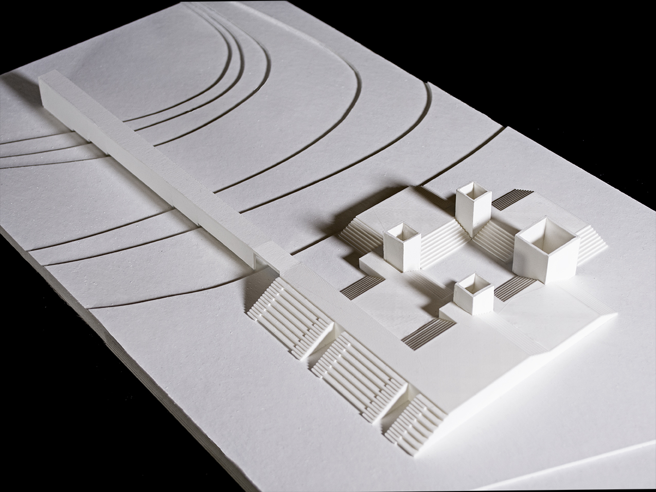
ROTHKO CHAPEL GATHERING CENTER
2018 / Cultural / Houston, TX / Size: 20,000 SF
The Rothko Chapel resides in Houston’s Montrose neighborhood, where the Menil Collection’s campus of freestanding, single-use buildings and repurposed bungalows blend seamlessly into the residential fabric. This proposed expansion to the Rothko Chapel introduces a vertical mixed-use urbanism to the suburban site, placing a visitor center, administrative offices, energy house, and a new gathering space all within a single building. As a site strategy, the building completes the axis from Barnett Newman’s Broken Obelisk to the Rothko Chapel. A new landcape of paving surrounds the original plaza to continue the axis towards the new building while registering an expansion from the historic condition of the plaza. The ramped entrance of this new building creates a second public plaza behind the chapel, activating the back of the chapel as a framed view. This upward slope provides a monumental entrance that indicates the new building’s expansion in scale, yet is also deferential to the chapel by directing views towards it. The building maintains a solid outward face that reveals fragmented vignettes of its active interior, in which programmatic volumes are projected towards a central atrium. This atrium stages an urban interior through the visual juxtaposition of a diverse set of activities that are simultaneously visible. This diversity results from the division of the new gathering space into multiple spaces of differing scales, so that multiple types of spiritual or non-spiritual experience can occupy the building at once. As such, the building refuses to produce a single totalizing experience of spirituality. Instead, the project embraces the mission of the Rothko Chapel in celebrating difference so that no collective will ever have ownership over the entire space.
M.Arch I Advanced Studio / Critics: Adam Yarinsky, Lexi Tsien-Shiang




CANARSIE AFTER THE RAIN
2018 / Urban + Infrastructural / Canarsie, Brooklyn, NY
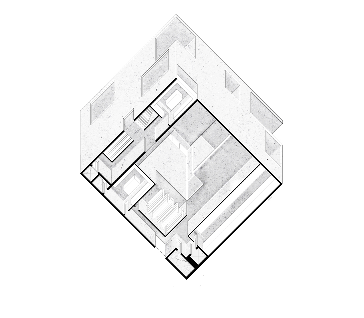
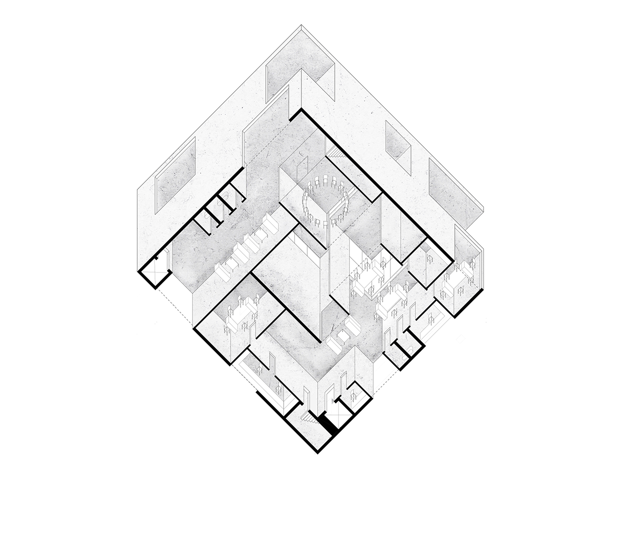
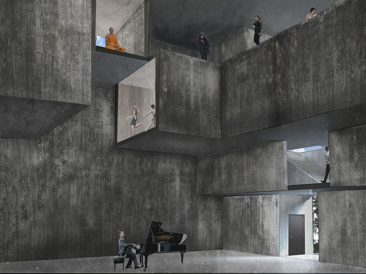
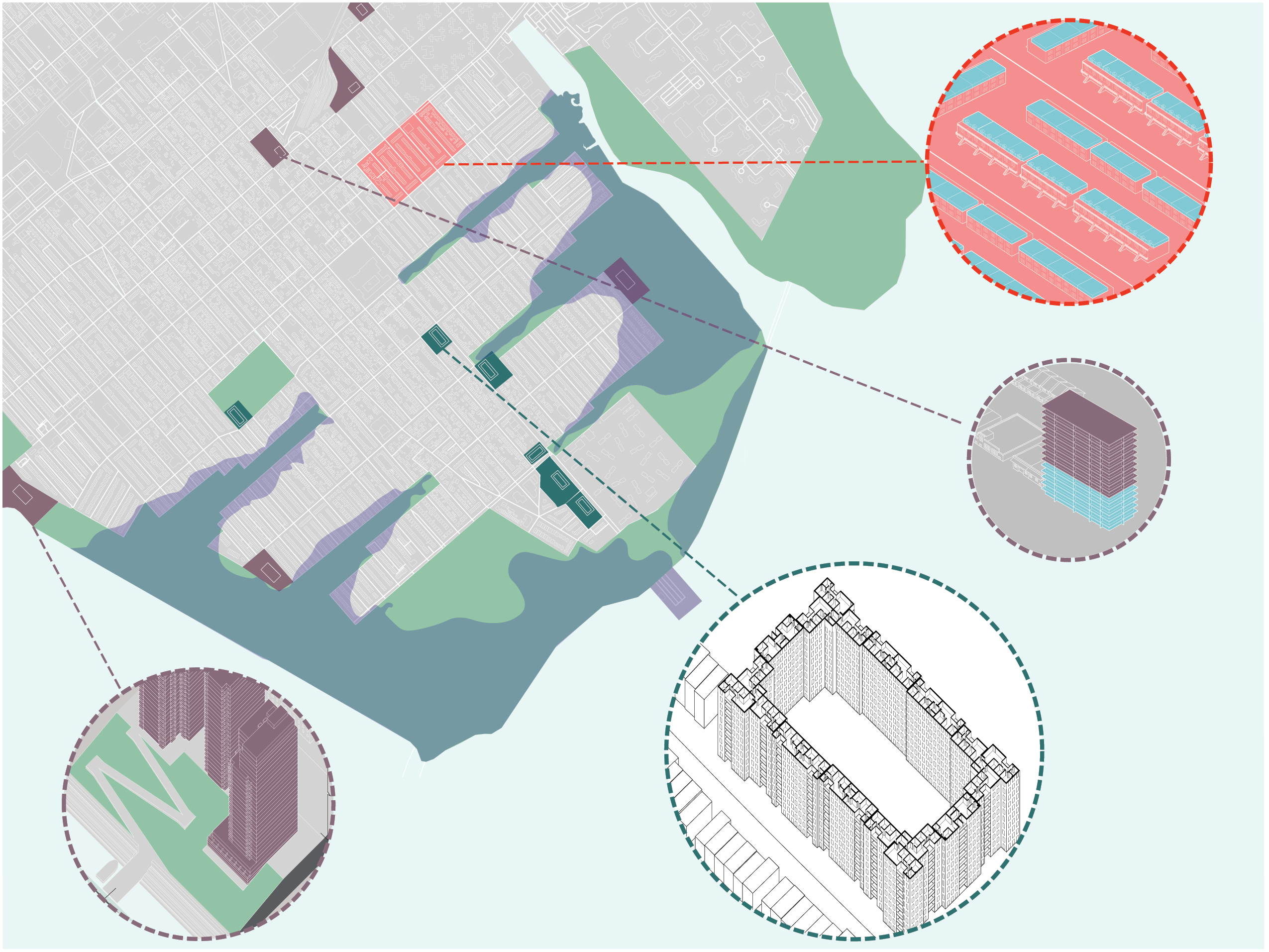
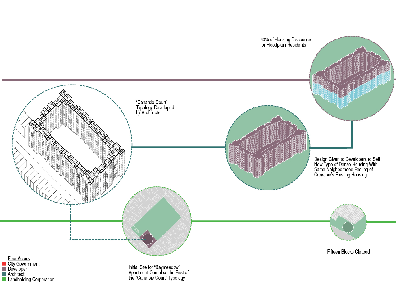
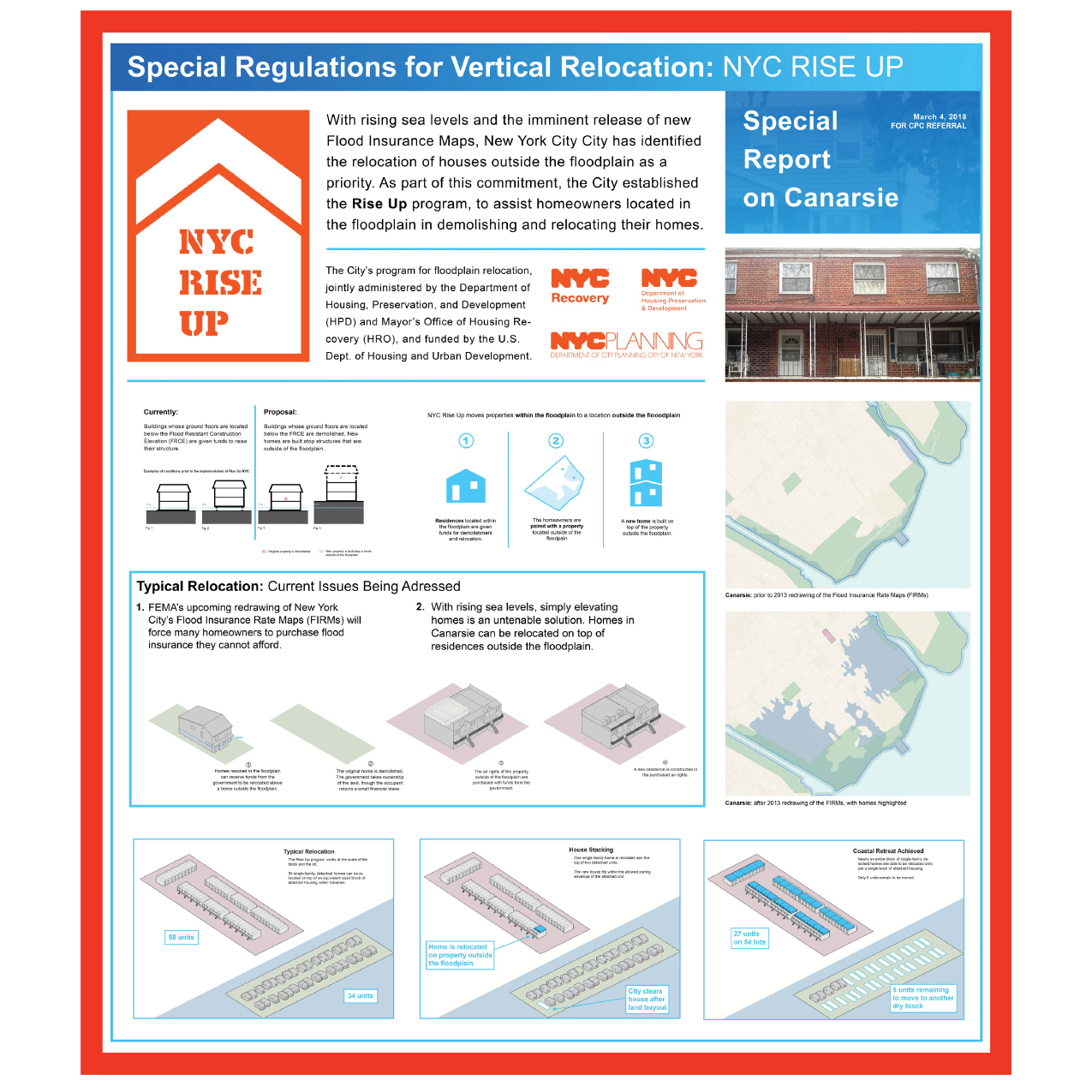
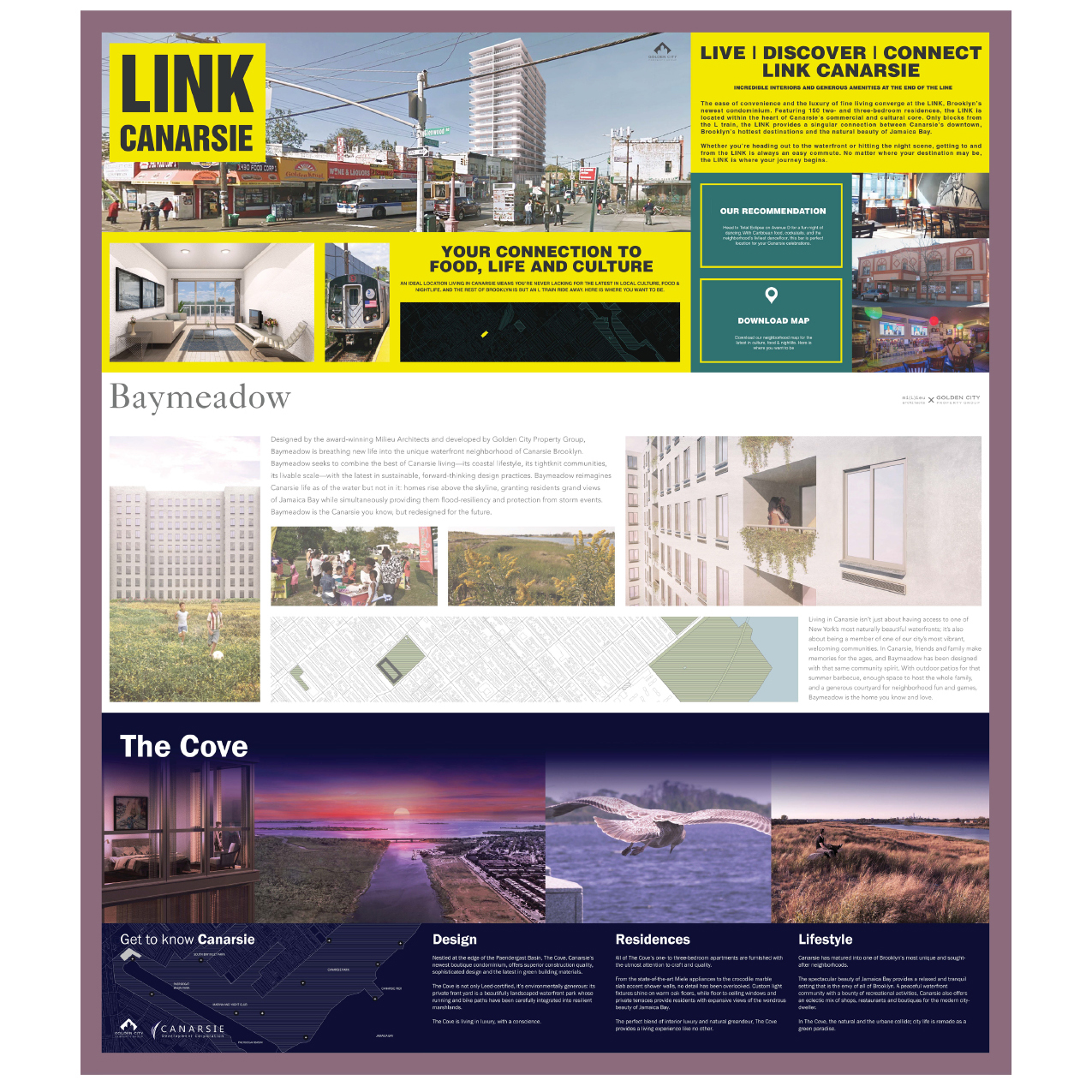
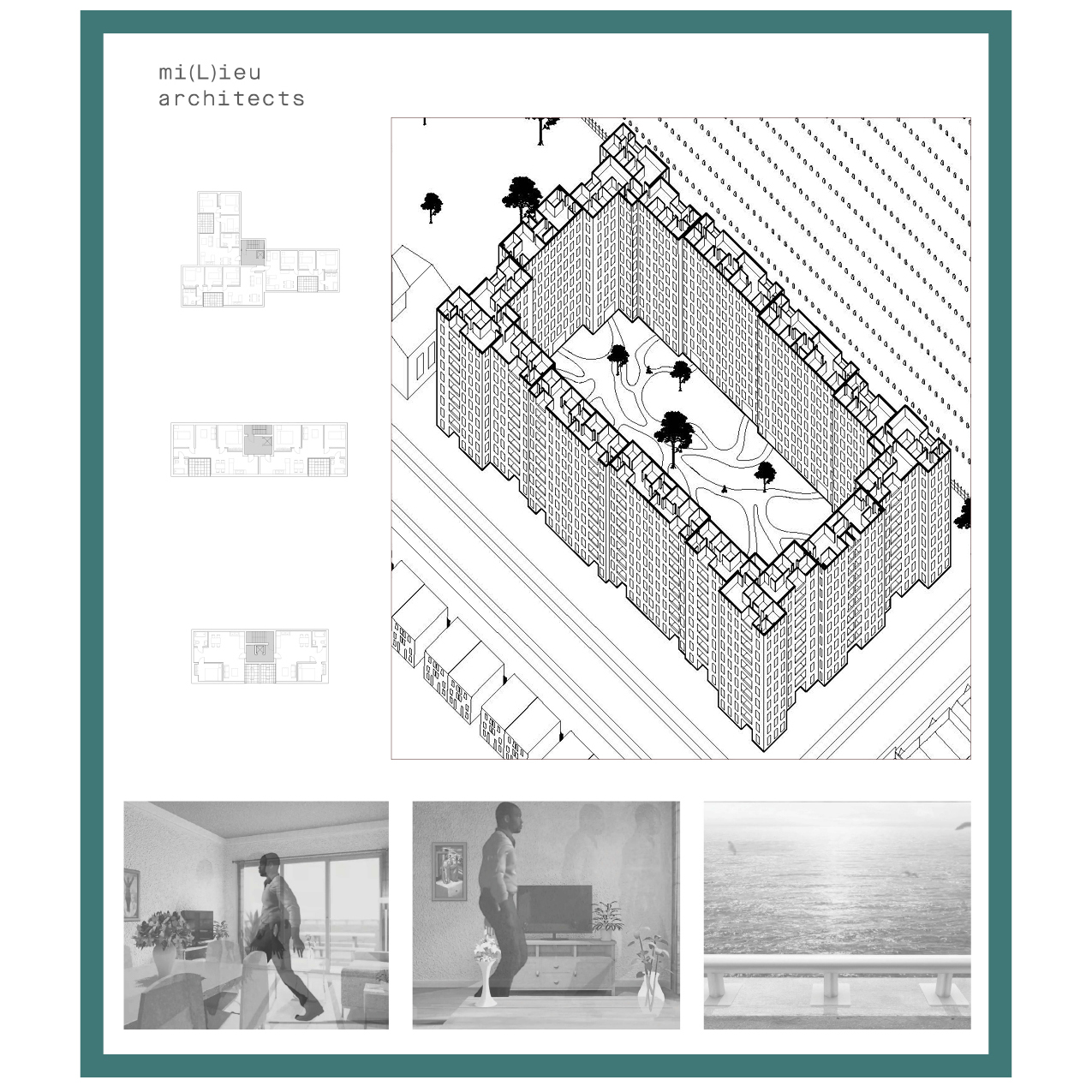
When FEMA’s redrew New York City’s flood insurance rate maps after Hurricane Sandy, homeowners in Canarsie, Brooklyn were faced with rising insurance premiums and decreasing property values with no economic means to escape the flood risk zone. This project is founded upon the contrasting notions and desires surrounding waterfront living: both a romanticized luxury and financially crippling reality. The solution to Canarsie’s housing crisis lies not in architectural form alone, but in leveraging the narratives and cultural imaginings of housing and land towards the relocation of floodplain residents and the resilient redevelopment of Canarsie. This project reconsiders design as a process of negotiating the interplay between spatial dispositifs, systems, protocols, and non-architectural actors. The proposal identifies four actors that shape the spatial environment of Canarsie: the City Government, the Real Estate Developer, the Architect, and the Land Development Corporation. Coupled with these four actors are four design contagions: exchanges between actors that redirect their individual interests towards a desired outcome. First, we propose a government program for relocating Canarsie floodplain residents to safer areas within neighborhood. We then leverage the desire and value for waterfront property to spur private development in Canarsie. These developments continue to draw homeowners out from the floodplain in exchange for land use rights. Finally, the cleared land is developed into resilient greenspace that doubles as luxury amenity. Though each actor acts entirely selfishly in their own interest, their desires are harnessed to achieve a humanitarian goal. Ultimately the project engages not with housing in its physical, architectural form, but investigates the values, desires, and cultural narratives that surround housing, and how these narratives can be designed and employed to leverage powerful actors into implementing a certain spatial outcome.
M.Arch I Fourth Semester Urban Studio / Critic: Keller Easterling
In collaboration with Nicholas Miller and Matthew Wagstaffe




RETURN TO PLACE
2020 / Pidgin 27
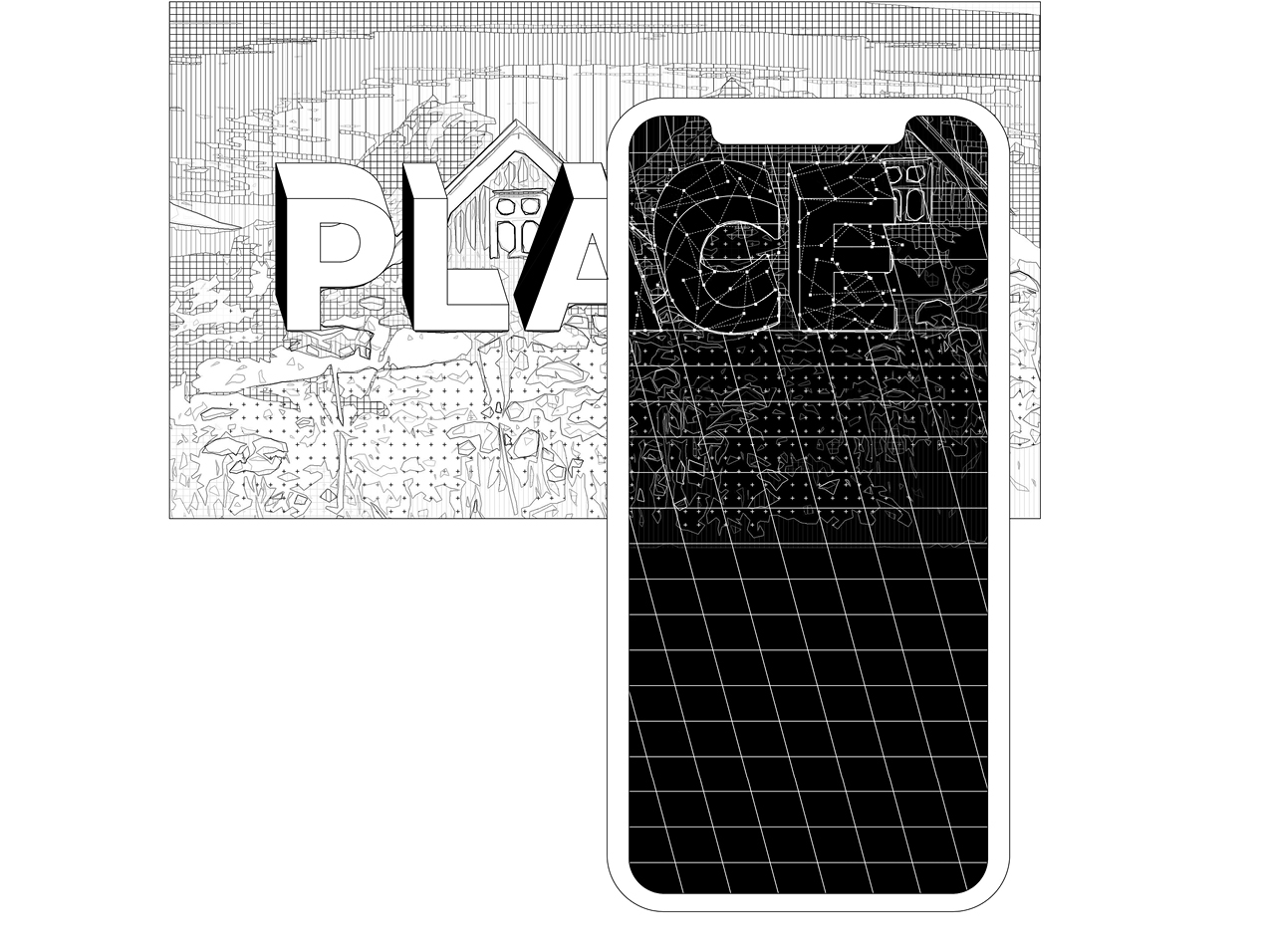
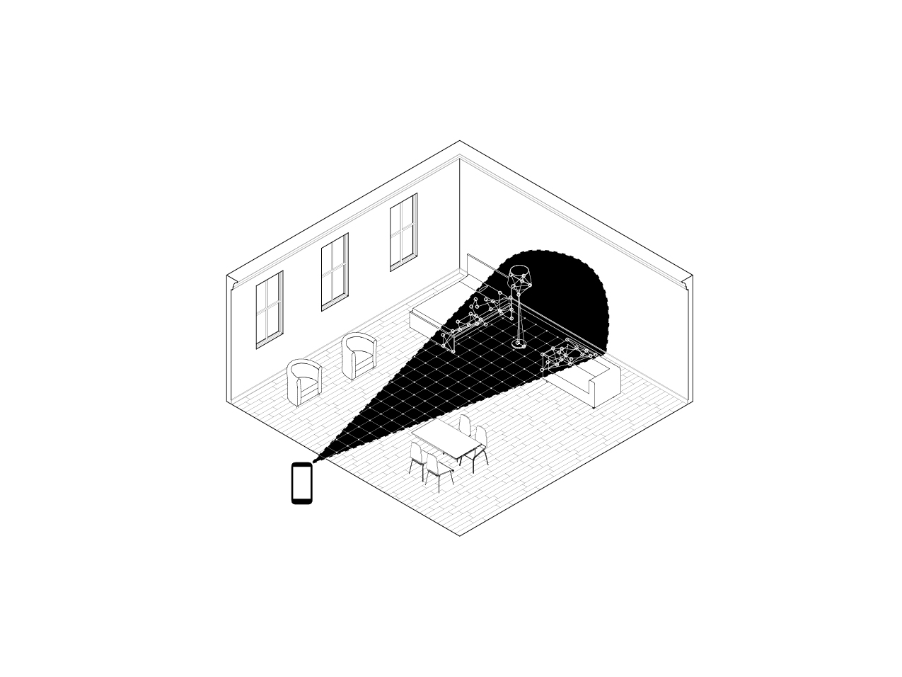
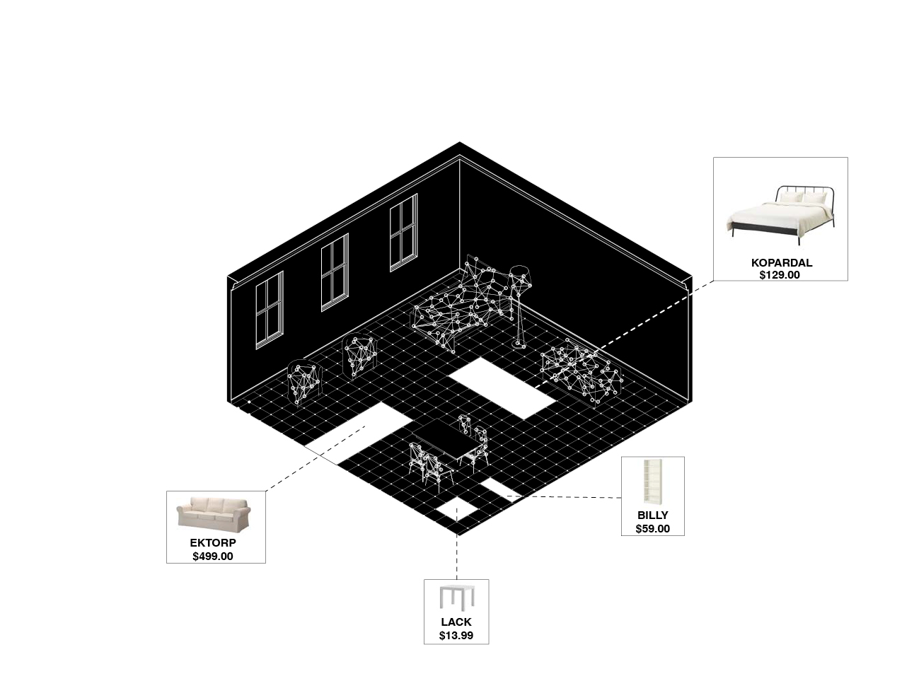
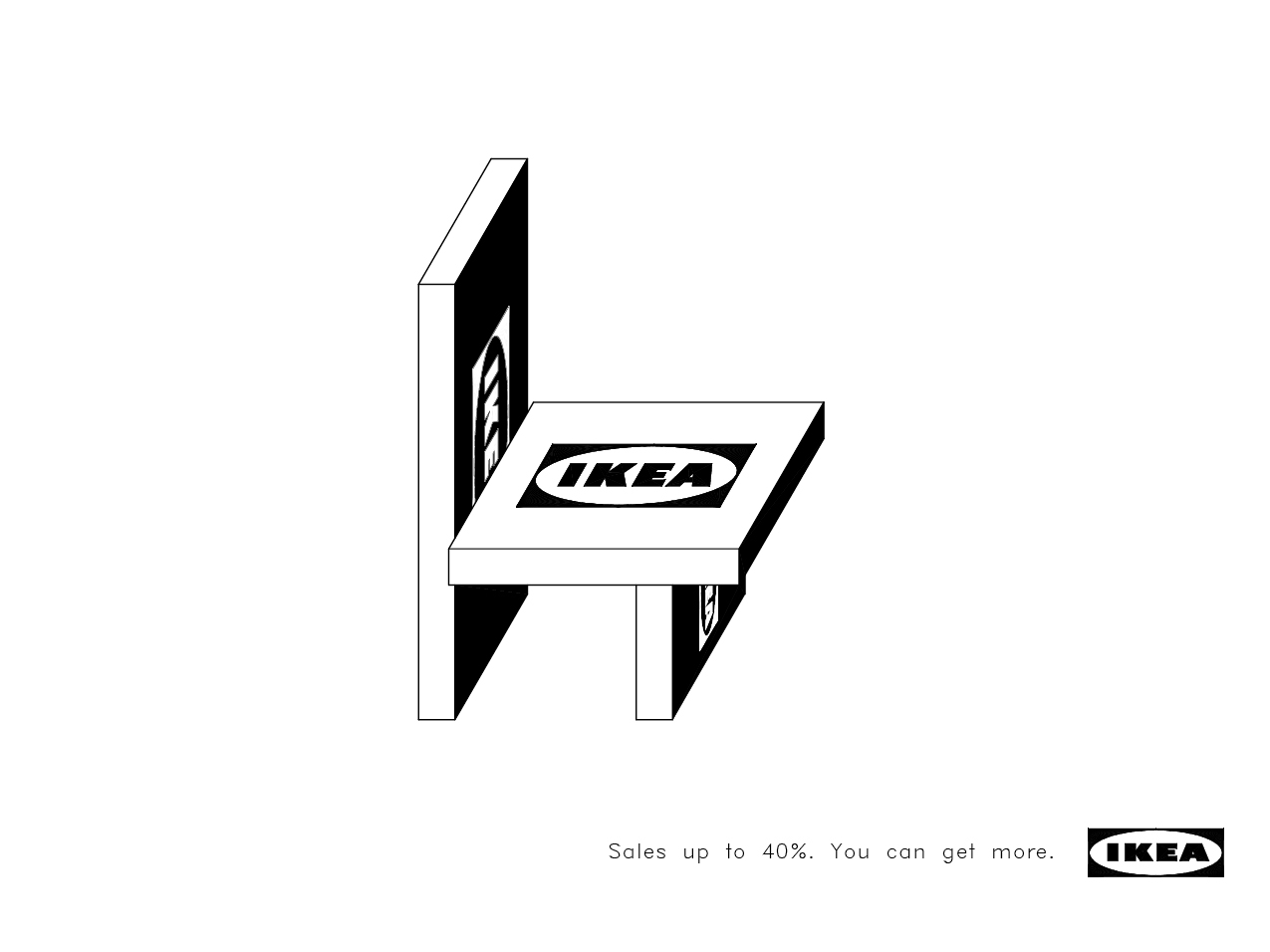
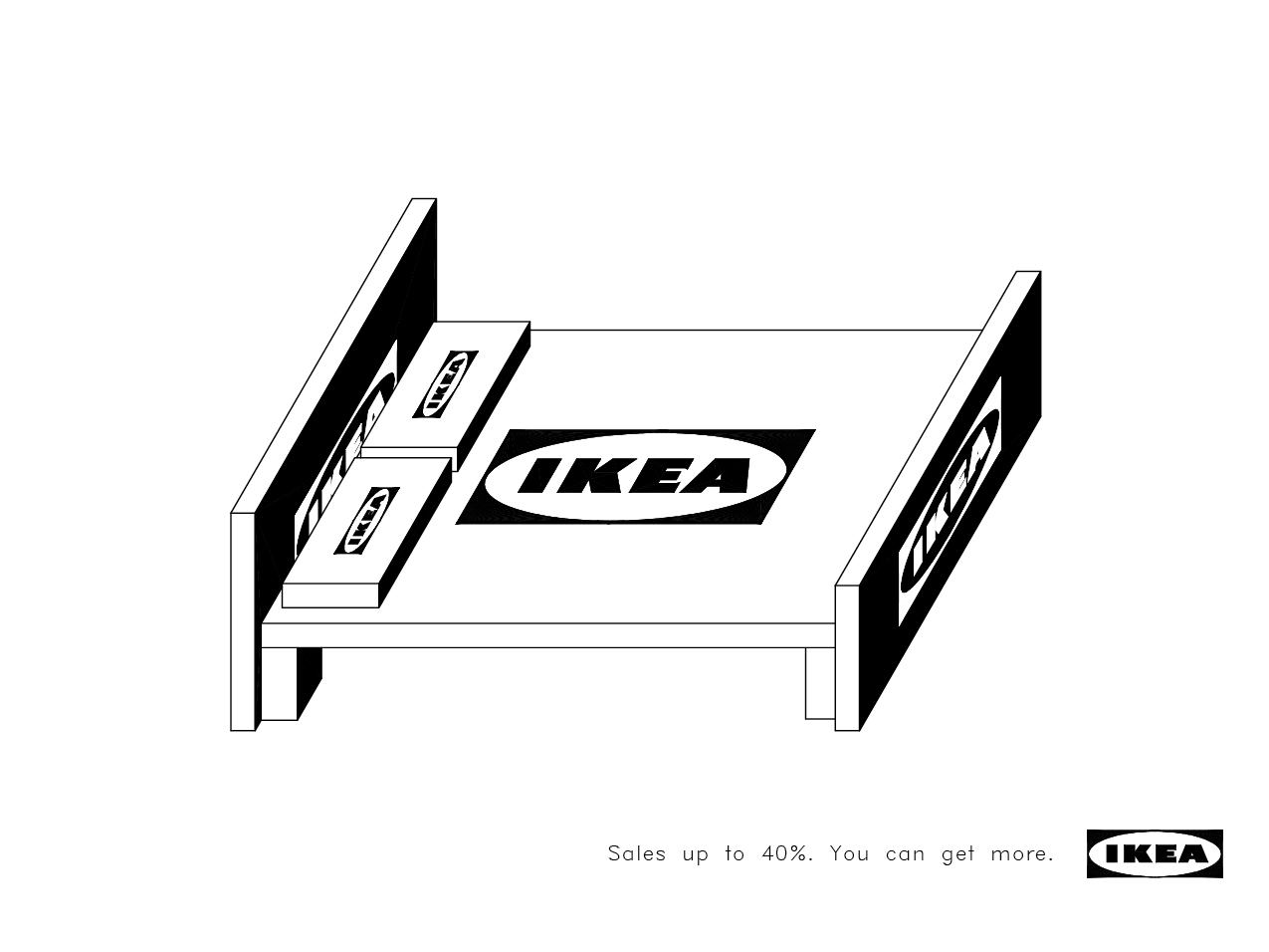
Marketed as the ultimate “try before you buy” app, IKEA Place presents the user with an augmented reality simulation of furniture so that the user can perceive the literal and aesthetic “fit” between a piece of furniture and the space of the home. IKEA’s operation, like that of most logistical actors, is concerned with the efficient movement and flow of objects between sites rather than the physical objects or sites themselves. As a consequence, this logistical strategy overlooks concerns of human aesthetic experience, producing sites of unfathomable spatial logic and objects designed for standardized transport rather than aesthetic consumption. While IKEA must turn physical objects into logistical products for ease of logistical distribution, these products must be re-ascribed as aesthetic objects when they reach the consumer’s domestic space. As an interface capable of translating logistical spaces and products into visually consumable information, augmented reality emerges as a powerful tool for re-aestheticizing logistics. IKEA Place is not merely a tool for streamlining the supply chain at the retail end, but aestheticizes a logistical regime of viewing space, transplanting logistical products into the space of the personal home as aesthetic items. The importance of PLACE in IKEA’s advertising campaign is indicative of this strategy. While logistics is agnostic to site as a place of bodily experience, IKEA Place promises to bring a logistical mode of thinking back into the realm of spatial experience, by employing its space planning technology towards the experience of one’s own PLACE. Yet in viewing space only as a container for the efficient placement of goods, IKEA Place reproduces the personal home as logistical space, detaching the home from notions of PLACE. Instead, IKEA Place aestheticizes IKEA’s logistical strategy into spectacle, making visible an otherwise immaterial operation for the purposes of advertisement.
Illustrations by Haylie Chan
Full Text
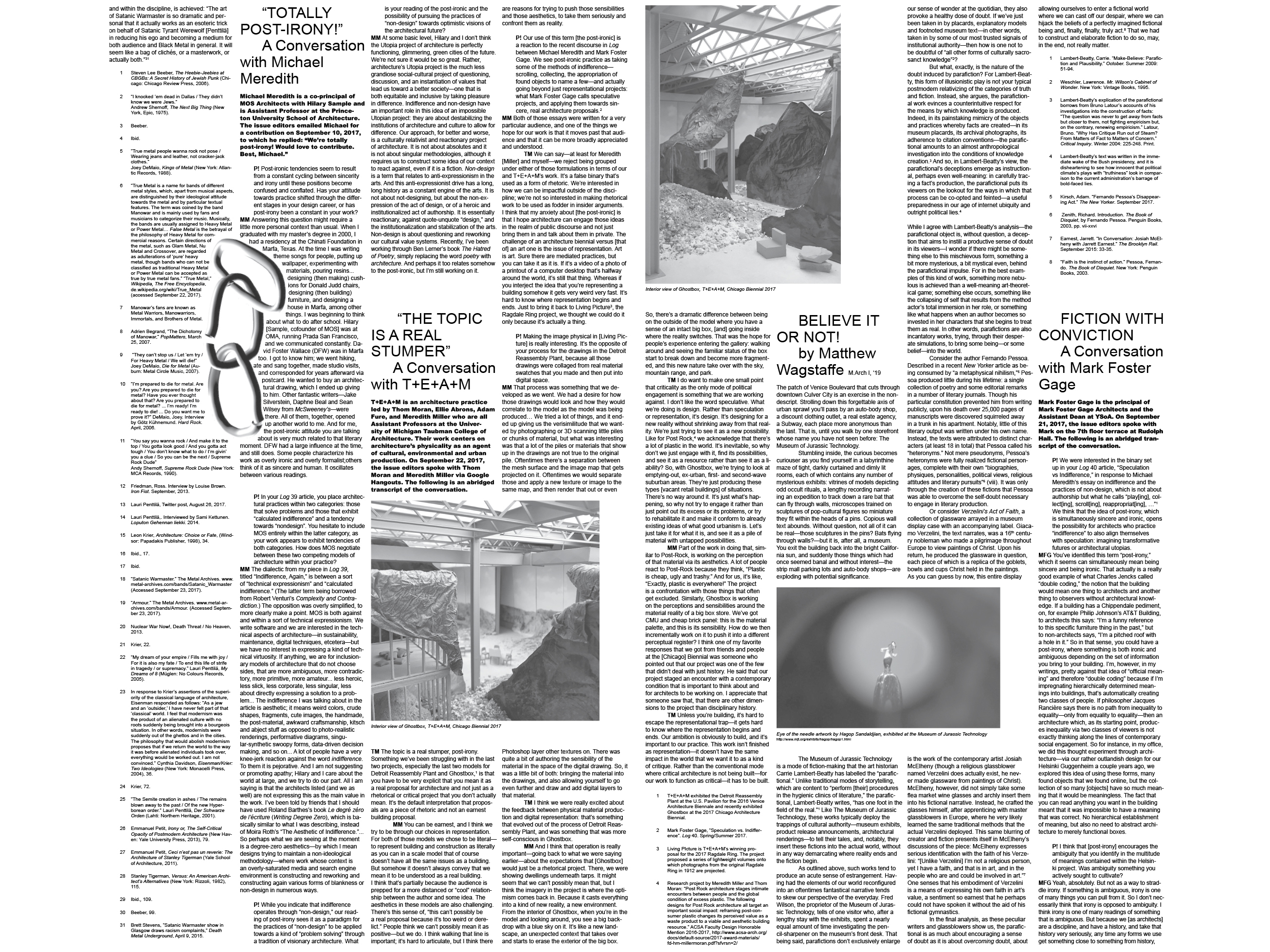
PAPRIKA! POST-IRONIC-POST
2017 / Paprika! Vol. 3 Issue 3
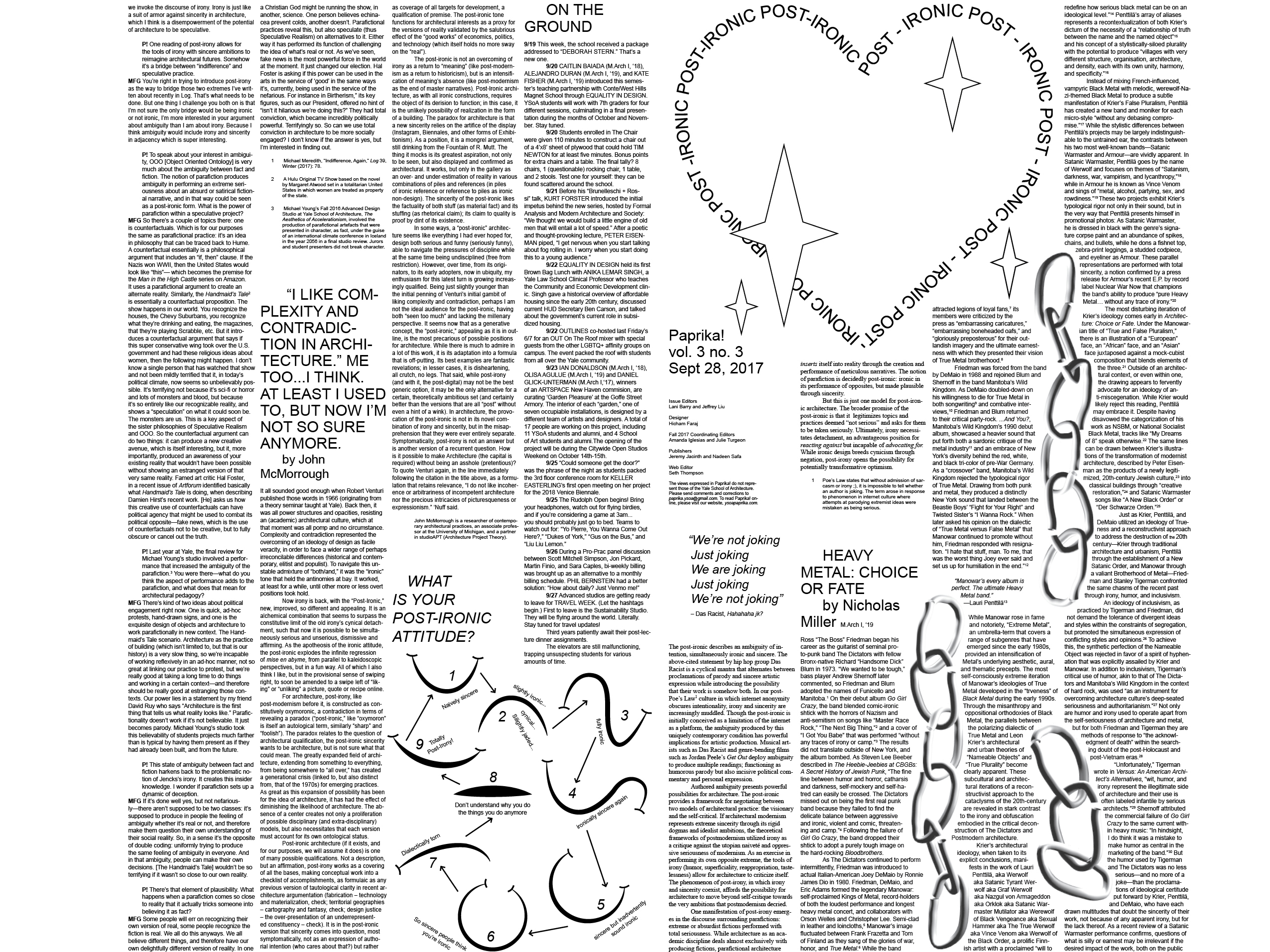
The post-ironic describes an ambiguity of intention, simultaneously ironic and sincere. In our post-Poe’s Law culture in which internet anonymity obscures intentionality, irony and sincerity are increasingly muddled. Though the post-ironic is initially conceived as a limitation of the internet as a platform, the ambiguity produced by this uniquely contemporary condition has powerful implications for artistic production. Post-ironic artists deploy ambiguity to produce multiple readings; functioning as humorous parody but also incisive political commentary and personal expression. Authored ambiguity presents powerful possibilities for architecture. The post-ironic provides a framework for negotiating between two models of architectural practice: the visionary and the self-critical. If architectural modernism represents extreme sincerity through its rigid dogmas and idealist ambitions, the theoretical frameworks of postmodernism utilized irony as a critique against the utopian naiveté and oppressive seriousness of modernism. As an exercise in performing its own opposite extreme, the tools of irony (humor, superficiality, reappropriation, tastelessness) allow for architecture to criticize itself. The phenomenon of post-irony, in which irony and sincerity coexist, affords the possibility for architecture to move beyond self-critique towards the very ambitions that postmodernism decried. The broader promise of the post-ironic is that it legitimizes topics and practices deemed “not serious” and asks for them to be taken seriously. Ultimately, irony necessitates detachment, an advantageous position for reacting against but incapable of advocating for. While ironic design breeds cynicism through negation, post-irony opens the possibility for potentially transformative optimism.
Edited with Lani Barry / Design by Hicham Faraj
Web / PDF
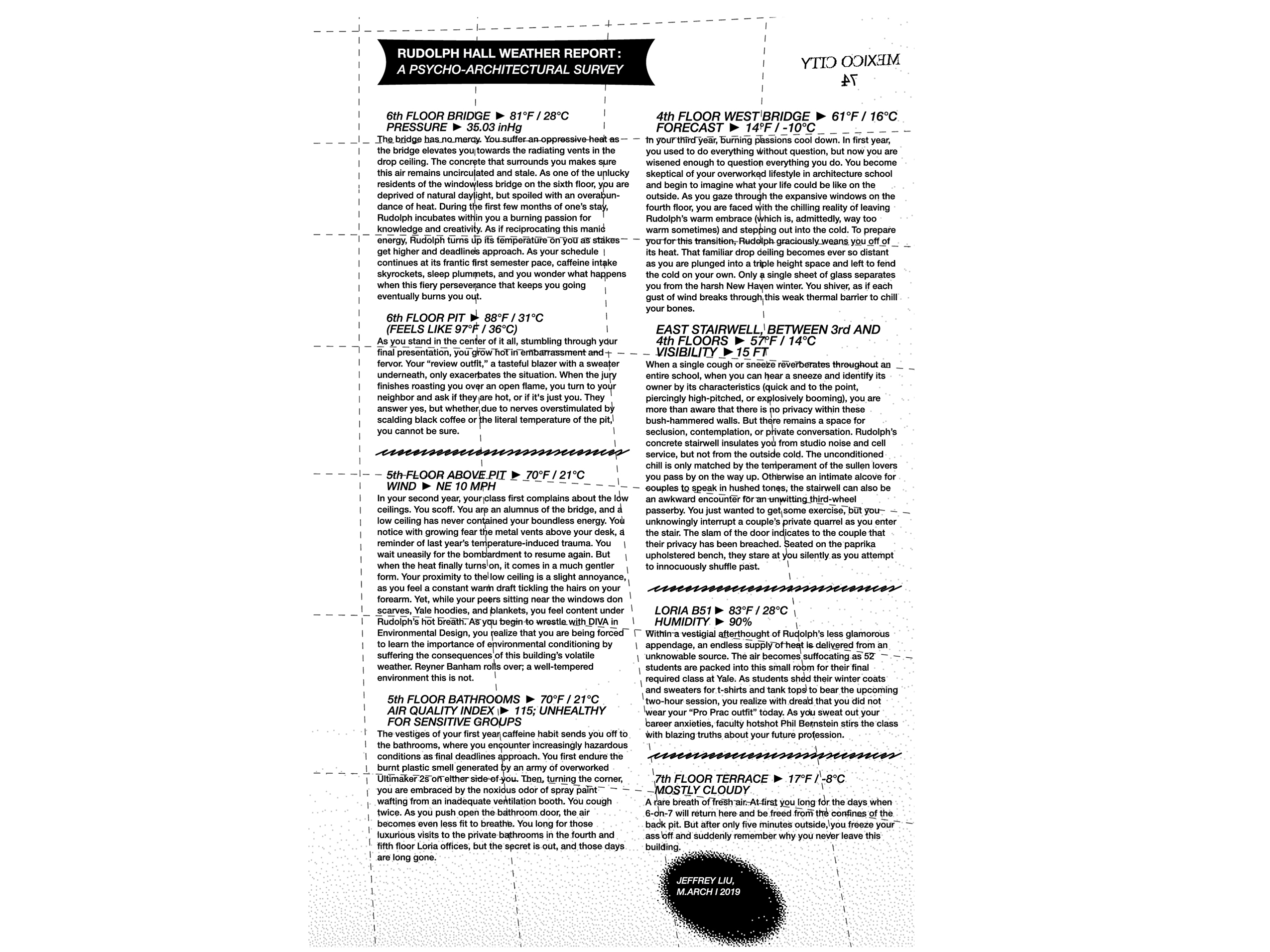
RUDOLPH HALL WEATHER REPORT: A PSYCHO-ARCHITECTURAL SURVEY
2019 / Published in Paprika! Vol 4 Issue 9: Temperature
6TH FLOOR BRIDGE: 81°F / 28°C
PRESSURE: 35.03 inHg
The bridge has no mercy. You suffer an oppressive heat as the bridge elevates you towards the radiating vents in the drop ceiling. The concrete that surrounds you makes sure this air remains uncirculated and stale. As one of the unlucky residents of the windowless bridge on the 6th floor, you are deprived of natural daylight, but spoiled with an overabundance of heat. During the first few months of one’s stay, Rudolph incubates within you a burning passion for knowledge and creativity. As if reciprocating this manic energy, Rudolph turns up its temperature on you as stakes get higher and deadlines approach. As your schedule continues at its frantic first semester pace, caffeine intake skyrockets, sleep plummets, and you wonder what happens when this fiery perseverance that keeps you going eventually burns you out.
6th FLOOR PIT: 88°F / 31°C
(FEELS LIKE 97°F / 36°C)
As you stand in the center of it all, stumbling through your final presentation, you grow hot in embarrassment and fervor. Your “review outfit,” a tasteful blazer with a sweater underneath, only exacerbates the situation. When the jury finishes roasting you over an open flame, you turn to your neighbor and ask if they are hot, or if it’s just you. They answer yes, but whether due to nerves overstimulated by scalding black coffee or the literal temperature of the pit, you cannot be sure.
Issue Editors: Page Comeaux, Nicole Doan, Alejandro Duran / Design by Dawoon Jeon
Full Text

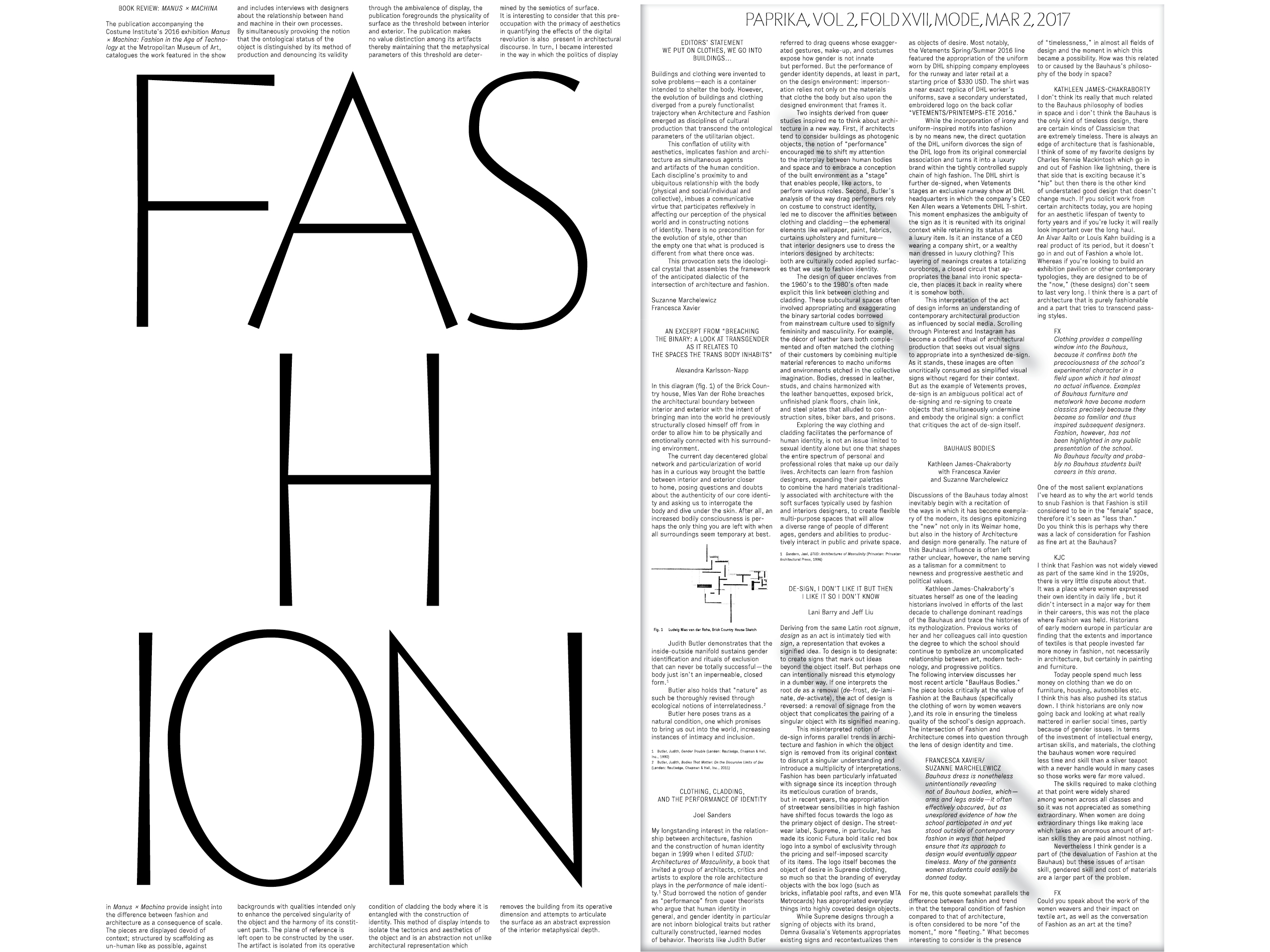
(DE)SIGN
2017 / Paprika! Vol 2 Issue 17: Mode
Deriving from the same Latin root signum, design as an act is intimately tied with sign, a representation that evokes a signified idea. To design is to designate: to create signs that mark out ideas beyond the object itself. But perhaps one can intentionally misread this etymology in a dumber way. If one interprets the root de as a removal (de-frost, de-laminate, de-activate), the act of design is reversed: a removal of signage from the object that complicates the pairing of a singular object with its signified meaning. This misinterpreted notion of de-sign informs parallel trends in architecture and fashion in which the object sign is removed from its original context to disrupt a singular understanding and introduce a multiplicity of interpretations. Fashion has been particularly infatuated with signage since its inception through its meticulous curation of brands, but in recent years, the appropriation of streetwear sensibilities in high fashion have shifted focus towards the logo as the primary object of design. The streetwear label, Supreme, in particular, has made its iconic Futura bold italic red box logo into a symbol of exclusivity through the pricing and self-imposed scarcity of its items. While Supreme designs through a signing of objects with its brand, Demna Gvasalia’s Vetements appropriates existing signs and recontextualizes them as objects of desire. Most notably, the Vetements Spring/Summer 2016 line featured the appropriation of the uniform worn by DHL shipping company employees for the runway and later retail at a starting price of $330 USD. The shirt was a near exact replica of DHL worker’s uniforms, save a secondary understated, embroidered logo on the back collar “VETEMENTS/PRINTEMPS-ETE 2016.” While the incorporation of irony and uniform-inspired motifs into fashion is by no means new, the direct quotation of the DHL uniform divorces the sign of the DHL logo from its original commercial association and turns it into a luxury brand within the tightly controlled supply chain of high fashion.
Issue Editors: Suzanne Marchelewicz, Francesca Xavier / Design by Bryce Wilner
In collaboration with Lani Barry / PDF
RISK PROTOCOL
2019 / Video Installation (1/4) / Seoul Biennale 2019 - Collective City
Keller Easterling’s piece for the 2019 Seoul Biennale of Architecture and Urbanism addresses the topic of the Collective City in four new videos depicting protocols for informal, loosely collective action. These videos depict a series of stop motion spatial games where individuals address challenges their communities face by trading problems to formulate collective solutions. Risk Protocol depicts a process of subtraction in floodprone areas to reduce collective climate risk through a bundling of mortgages.
Video Team: Keller Easterling, Jeffrey Liu, Matthew Wagstaffe, Paul Lorenz
Graphic Design: Steven Rodriguez
Fabrication: Juan Pablo Ponce de Leon, Adam Feldman
Exhibited in Seoul Biennale 2019 - Collective City with Keller Easterling
Published in E-Flux Architecture
OVERDEVELOPMENT PROTOCOL
2019 / Video Installation (2/4) / Seoul Biennale 2019 - Collective City
Overdevelopment Protocol outlines a similar notion of subtraction that addresses deforestation by linking the benefits of reforested areas with incentives for densification.
Video Team: Keller Easterling, Jeffrey Liu, Matthew Wagstaffe, Paul Lorenz
Graphic Design: Steven Rodriguez
Fabrication: Juan Pablo Ponce de Leon, Adam Feldman
Exhibited in Seoul Biennale 2019 - Collective City with Keller Easterling
Published in E-Flux Architecture
NEED PROTOCOL
2019 / Video Installation (3/4) / Seoul Biennale 2019 - Collective City
Need Protocol explores the spatial interplay behind Social Capital Credits, coined by Geehta Mehta as a way to consider needs as currencies to be exchanged, which accumulate as collective benefits.
Video Team: Keller Easterling, Jeffrey Liu, Matthew Wagstaffe, Paul Lorenz
Graphic Design: Steven Rodriguez
Fabrication: Juan Pablo Ponce de Leon, Adam Feldman
Exhibited in Seoul Biennale 2019 - Collective City with Keller Easterling
Published in E-Flux Architecture
DISASTER PROTOCOL
2019 / Video Installation (4/4) / Seoul Biennale 2019 - Collective City
Disaster Protocol portrays the process of Participatory Land Readjustment as a communal act of rearranging land ownership to increase the value of land as a whole.
Video Team: Keller Easterling, Jeffrey Liu, Matthew Wagstaffe, Paul Lorenz
Graphic Design: Steven Rodriguez
Fabrication: Juan Pablo Ponce de Leon, Adam Feldman
Exhibited in Seoul Biennale 2019 - Collective City with Keller Easterling
Published in E-Flux Architecture
VILLA TYCOON
2017 / Video
Recognizing the inherent absurdity of Le Corbusier’s notion of architecture as a “machine for living” in attempting to couple the machinic with the human, this animation reimagines Villa Stein as a Rube Goldberg machine for human motion. The video concieves of the Villa as an amusement park ride: a set of chain reactions for human exhilaration. The video translates Corbusier’s conception of the machine for life from purely aesthetic to literal.
Team: Jeffrey Liu, Nancy Chen, Anna Rothschild, Issy Yi
Shadow Housing is a model for collective living in a post-pandemic era: an open-air live/work commons that configures new domestic schedules of work and care through an architecture of light and shadows. As COVID-19 ruptures the boundary between the office and the home, the available time for domestic labor such as cooking or childcare is being subsumed by a “flexible” expanded workday. While the eight hour workday reflects an abstracted “clock time” coextensive with the capitalist emphasis on productive labor over unwaged housework, Shadow Housing embodies a natural time that tethers the workday to the movement of the sun, establishing a spatial and temporal separation between work and the necessary labor of care. In moving from an immaterial/universal timekeeping to a physical form of timekeeping dictated by the sun, Shadow Housing spatializes time to resist the blurring of working and living, and reestablishes the circadian rituals of the home. Situated in the temperate, arid climate of central Los Angeles, Shadow Housing proposes a pandemic-safe form of outdoor co-living where daily activity alternates between periods of work and shared domestic labor as directed by shadow and sunlight. Above a ground floor of enclosed private units and semi-enclosed patio rooms shared by two units, the rooftop common space is composed from a series of walls angled to cast shadows, forming shaded outdoor rooms for work and collective care at designated times of day. Demarcated by lines that approximate the average shadow length and angle at the specified time of day, these spaces shift in and out of alignment with the casted shadows according to their scheduled time of use within a reconstituted workday.
Design Research
Care Office
Overall Winner, HOME Competition 2020
Published in ArchDaily, Archinect, and designboom
Design Research
Care Office
Overall Winner, HOME Competition 2020
Published in ArchDaily, Archinect, and designboom
Drawing from the dingbat’s structure in elevating living spaces to create useable covered space below, as well as the bungalow court’s spatial arrangement of units around a central courtyard, Dingbat Court is an affordable housing model that combines and reinvents both typologies for communal living while establishing public space for neighborhood use. The building’s structurally open ground floor centers around a public courtyard for outdoor gathering and community gardening. The street-facing sides of the building provide shaded public space, residential parking, and a small-scale retail space at the corner, creating a porous edge for public engagement at the street level. Thus, Dingbat Court’s porous street facades bring the public into the center of the building, while accessible residential units occupy the non-street facing edges of the ground floor. Sited on a combined lot at the corner of two streets, the building creates a new public space for the neighborhood to gather and engage in small-scale food production. The elevated second level reflects the spatial composition of the bungalow court: two duplexes and two freestanding units organized around a central void. While these four bungalow units remain separate from one another, they are connected by semi-enclosed “wintergarden” spaces of wood-framed polycarbonate. These unconditioned wintergardens allocate expanded areas for communal food production, care, and housework without the increased cost of additional enclosure. Located at the shared entry between individual units, these wintergardens provide space for mutual aid where residents can grow vegetables together, care for each other’s children and elders, and share duties for cooking and laundry, lessening each family’s individual burden of reproductive labor.
Competition Entry for Low-Rise: Housing Ideas for Los Angeles
Care Office
Published in FRAME 141
Competition Entry for Low-Rise: Housing Ideas for Los Angeles
Care Office
Published in FRAME 141
Built in the late 1980s by the municipality of Guidonia Montecelio in the north-east Roman Agro, Albuccione was one of the last social housing projects to be built in Rome, in an era when the government used social housing to train residents for private homeownership rather than advocate for communal forms of living. To the south of this social housing are two informal communities where settlement has occurred along slender, linear agrarian fields. The physical constraint of the linear lots and the lack of infrastructure for these settlements have forced residents to build informal secondary structures to perform labor that their primary residence cannot accommodate. Thus, Albuccione is a settlement where the household has been disassembled into various elements, scattered across the site, and reconstituted in diffuse form. With a third of its population over the age of 65 and an even greater number forced to partially dwell in shoddily-built structures, Albuccione is facing a crisis of care. However problematic in its current state, this deconstructed condition of domesticity also presents an opportunity to reinvent reproductive labor as a shared public ritual rather than one belonging to the private domestic sphere. This project reconstitutes the household as a linear strip of collective rooms for the commoning of reproductive labor and care. The project first implements a “comb” structure of platforms along a linear path, which provides common space between existing homes for shared domestic activity. This subdivision provides structure for densification through a new model of communal housing: single-story assisted living units with communal spaces where residents care for one another and engage in shared agricultural and industrial production. Though this process of commoning operates as a ground-up protocol, beginning with the agreement between individual families to share basic domestic resources and labor, it can eventually reorganize the structure of each settlement as a whole according to the logic of communal care and provide the settlement with a legible infrastructure for new communal rituals of domesticity.
M.Arch I Advanced Studio
Critics: Pier Vittorio Aureli, Emily Abruzzo
In collaboration with Haylie Chan
Published in Retrospecta 42
M.Arch I Advanced Studio
Critics: Pier Vittorio Aureli, Emily Abruzzo
In collaboration with Haylie Chan
Published in Retrospecta 42
As a ferry terminal, kitchen incubator, and marketplace for Clason Point, Living Theater turns a nexus of physical and commercial exchange into a space of performance and spectatorship. Living Theater posits public space as a theater of everyday life. The building constructs moments of performative action and spectatorship primarily through sectional differentiation: employing flat platforms as stages while raised steps serve as seating for observation. The tectonic form of the building allows for this sectional denotation of performance/spectatorship. The building is an elevated mass that rests on four structural and circulatory cores. This structural system enables an unobstructed free plan that is transformed into a free section. In raising the warehouse and kitchen incubator/co-working space, the ground beneath the building becomes a public plaza. The ground level is an open array of platforms and stairs that double as stages and seating, respectively. The platforms directly under the building become a covered marketplace and open social space for impromptu events and performances, while the eastern edge of the ground floor serves as the ferry terminal boarding area. Within the building mass itself, the plan remains open to enable visual continuity and fluidity in moving between areas of performance and spectatorship. Despite the openness of the plan and section, however, Living Theater is not a neutral container for events, but employs the specific constraints of architectural form to influence user activity towards the performative. As a building that turns everyday event into theater, narrative fiction is not only an important means of representation but also a generative tool for design. These narratives scripts dictate an experiential procession in which users undergo fluid shifts between performing and spectating, vignettes which then become physicalized as built form; thus, the building becomes the physical artifact of the narratives it generates.
M.Arch I Third Semester Studio
Critic: Emily Abruzzo
Size: 40,000 SF
Published in Retrospecta 41
M.Arch I Third Semester Studio
Critic: Emily Abruzzo
Size: 40,000 SF
Published in Retrospecta 41
The Rothko Chapel resides in Houston’s Montrose neighborhood, where the Menil Collection’s campus of freestanding, single-use buildings and repurposed bungalows blend seamlessly into the residential fabric. This proposed expansion to the Rothko Chapel introduces a vertical mixed-use urbanism to the suburban site, placing a visitor center, administrative offices, energy house, and a new gathering space all within a single building. As a site strategy, the building completes the axis from Barnett Newman’s Broken Obelisk to the Rothko Chapel. A new landcape of paving surrounds the original plaza to continue the axis towards the new building while registering an expansion from the historic condition of the plaza. The ramped entrance of this new building creates a second public plaza behind the chapel, activating the back of the chapel as a framed view. This upward slope provides a monumental entrance that indicates the new building’s expansion in scale, yet is also deferential to the chapel by directing views towards it. The building maintains a solid outward face that reveals fragmented vignettes of its active interior, in which programmatic volumes are projected towards a central atrium. This atrium stages an urban interior through the visual juxtaposition of a diverse set of activities that are simultaneously visible. This diversity results from the division of the new gathering space into multiple spaces of differing scales, so that multiple types of spiritual or non-spiritual experience can occupy the building at once. As such, the building refuses to produce a single totalizing experience of spirituality. Instead, the project embraces the mission of the Rothko Chapel in celebrating difference so that no collective will ever have ownership over the entire space.
M.Arch I Advanced Studio
Critics: Adam Yarinsky, Lexi Tsien-Shiang
Size: 20,000 SF
M.Arch I Advanced Studio
Critics: Adam Yarinsky, Lexi Tsien-Shiang
Size: 20,000 SF
When FEMA’s redrew New York City’s flood insurance rate maps after Hurricane Sandy, homeowners in Canarsie, Brooklyn were faced with rising insurance premiums and decreasing property values with no economic means to escape the flood risk zone. This project is founded upon the contrasting notions and desires surrounding waterfront living: both a romanticized luxury and financially crippling reality. The solution to Canarsie’s housing crisis lies not in architectural form alone, but in leveraging the narratives and cultural imaginings of housing and land towards the relocation of floodplain residents and the resilient redevelopment of Canarsie. This project reconsiders design as a process of negotiating the interplay between spatial dispositifs, systems, protocols, and non-architectural actors. The proposal identifies four actors that shape the spatial environment of Canarsie: the City Government, the Real Estate Developer, the Architect, and the Land Development Corporation. Coupled with these four actors are four design contagions: exchanges between actors that redirect their individual interests towards a desired outcome. First, we propose a government program for relocating Canarsie floodplain residents to safer areas within neighborhood. We then leverage the desire and value for waterfront property to spur private development in Canarsie. These developments continue to draw homeowners out from the floodplain in exchange for land use rights. Finally, the cleared land is developed into resilient greenspace that doubles as luxury amenity. Though each actor acts entirely selfishly in their own interest, their desires are harnessed to achieve a humanitarian goal. Ultimately the project engages not with housing in its physical, architectural form, but investigates the values, desires, and cultural narratives that surround housing, and how these narratives can be designed and employed to leverage powerful actors into implementing a certain spatial outcome.
M.Arch I Fourth Semester Urban Studio
Critic: Keller Easterling
In collaboration with Nicholas Miller and Matthew Wagstaffe
M.Arch I Fourth Semester Urban Studio
Critic: Keller Easterling
In collaboration with Nicholas Miller and Matthew Wagstaffe
Marketed as the ultimate “try before you buy” app, IKEA Place presents the user with an augmented reality simulation of furniture so that the user can perceive the literal and aesthetic “fit” between a piece of furniture and the space of the home. IKEA’s operation, like that of most logistical actors, is concerned with the efficient movement and flow of objects between sites rather than the physical objects or sites themselves. As a consequence, this logistical strategy overlooks concerns of human aesthetic experience, producing sites of unfathomable spatial logic and objects designed for standardized transport rather than aesthetic consumption. While IKEA must turn physical objects into logistical products for ease of logistical distribution, these products must be re-ascribed as aesthetic objects when they reach the consumer’s domestic space. As an interface capable of translating logistical spaces and products into visually consumable information, augmented reality emerges as a powerful tool for re-aestheticizing logistics. IKEA Place is not merely a tool for streamlining the supply chain at the retail end, but aestheticizes a logistical regime of viewing space, transplanting logistical products into the space of the personal home as aesthetic items. The importance of PLACE in IKEA’s advertising campaign is indicative of this strategy. While logistics is agnostic to site as a place of bodily experience, IKEA Place promises to bring a logistical mode of thinking back into the realm of spatial experience, by employing its space planning technology towards the experience of one’s own PLACE. Yet in viewing space only as a container for the efficient placement of goods, IKEA Place reproduces the personal home as logistical space, detaching the home from notions of PLACE. Instead, IKEA Place aestheticizes IKEA’s logistical strategy into spectacle, making visible an otherwise immaterial operation for the purposes of advertisement.
Illustrations by Haylie Chan
Issue Editors: Jonah Coe-Scharff, Chase Galis, Ryan Hughes, Anna Kerr, Jamie Lipson, Christina Moushoul, Sonia Sobrino Ralston, Anna Renken, Ian Ting
Full Text
Illustrations by Haylie Chan
Issue Editors: Jonah Coe-Scharff, Chase Galis, Ryan Hughes, Anna Kerr, Jamie Lipson, Christina Moushoul, Sonia Sobrino Ralston, Anna Renken, Ian Ting
Full Text
The post-ironic describes an ambiguity of intention, simultaneously ironic and sincere. In our post-Poe’s Law culture in which internet anonymity obscures intentionality, irony and sincerity are increasingly muddled. Though the post-ironic is initially conceived as a limitation of the internet as a platform, the ambiguity produced by this uniquely contemporary condition has powerful implications for artistic production. Post-ironic artists deploy ambiguity to produce multiple readings; functioning as humorous parody but also incisive political commentary and personal expression. Authored ambiguity presents powerful possibilities for architecture. The post-ironic provides a framework for negotiating between two models of architectural practice: the visionary and the self-critical. If architectural modernism represents extreme sincerity through its rigid dogmas and idealist ambitions, the theoretical frameworks of postmodernism utilized irony as a critique against the utopian naiveté and oppressive seriousness of modernism. As an exercise in performing its own opposite extreme, the tools of irony (humor, superficiality, reappropriation, tastelessness) allow for architecture to criticize itself. The phenomenon of post-irony, in which irony and sincerity coexist, affords the possibility for architecture to move beyond self-critique towards the very ambitions that postmodernism decried. The broader promise of the post-ironic is that it legitimizes topics and practices deemed “not serious” and asks for them to be taken seriously. Ultimately, irony necessitates detachment, an advantageous position for reacting against but incapable of advocating for. While ironic design breeds cynicism through negation, post-irony opens the possibility for potentially transformative optimism.
Edited with Lani Barry
Design by Hicham Faraj
Web / PDF
Edited with Lani Barry
Design by Hicham Faraj
Web / PDF
/
/
RUDOLPH HALL WEATHER REPORT: A PSYCHO-ARCHITECTURAL SURVEY
2019 / Published in Paprika! Vol 4 Issue 9: Temperature


6TH FLOOR BRIDGE: 81°F / 28°C
PRESSURE: 35.03 inHg
The bridge has no mercy. You suffer an oppressive heat as the bridge elevates you towards the radiating vents in the drop ceiling. The concrete that surrounds you makes sure this air remains uncirculated and stale. As one of the unlucky residents of the windowless bridge on the 6th floor, you are deprived of natural daylight, but spoiled with an overabundance of heat. During the first few months of one’s stay, Rudolph incubates within you a burning passion for knowledge and creativity. As if reciprocating this manic energy, Rudolph turns up its temperature on you as stakes get higher and deadlines approach. As your schedule continues at its frantic first semester pace, caffeine intake skyrockets, sleep plummets, and you wonder what happens when this fiery perseverance that keeps you going eventually burns you out.
6th FLOOR PIT: 88°F / 31°C
(FEELS LIKE 97°F / 36°C)
As you stand in the center of it all, stumbling through your final presentation, you grow hot in embarrassment and fervor. Your “review outfit,” a tasteful blazer with a sweater underneath, only exacerbates the situation. When the jury finishes roasting you over an open flame, you turn to your neighbor and ask if they are hot, or if it’s just you. They answer yes, but whether due to nerves overstimulated by scalding black coffee or the literal temperature of the pit, you cannot be sure.
Issue Editors: Page Comeaux, Nicole Doan, Alejandro Duran
Design by Da Woon Jeon
Full Text
Deriving from the same Latin root signum, design as an act is intimately tied with sign, a representation that evokes a signified idea. To design is to designate: to create signs that mark out ideas beyond the object itself. But perhaps one can intentionally misread this etymology in a dumber way. If one interprets the root de as a removal (de-frost, de-laminate, de-activate), the act of design is reversed: a removal of signage from the object that complicates the pairing of a singular object with its signified meaning. This misinterpreted notion of de-sign informs parallel trends in architecture and fashion in which the object sign is removed from its original context to disrupt a singular understanding and introduce a multiplicity of interpretations. Fashion has been particularly infatuated with signage since its inception through its meticulous curation of brands, but in recent years, the appropriation of streetwear sensibilities in high fashion have shifted focus towards the logo as the primary object of design. The
streetwear label, Supreme, in particular, has made its iconic Futura bold italic red box logo into a symbol of exclusivity through the pricing and self-imposed scarcity of its items. While Supremedesigns through a signing of objects with its brand, Demna Gvasalia’s Vetements appropriates existing signs and recontextualizes them as objects of desire. Most notably, the Vetements Spring/Summer 2016 line featured the appropriation of the uniform worn by DHL shipping company employees for the runway and later retail at a starting price of $330 USD. The shirt was a near exact replica of DHL worker’s uniforms, save a secondary understated, embroidered logo on the back collar “VETEMENTS/PRINTEMPS-ETE 2016.”
While the incorporation of irony and uniform-inspired motifs into fashion is by no means new, the direct quotation of the DHL uniform divorces the sign of the DHL logo from its original commercial association and turns it into a luxury brand within the tightly controlled supply chain of high fashion.
Issue Editors: Suzanne Marchelewicz, Francesca Xavier
Design by Bryce Wilner
In collaboration with Lani Barry
PDF
While the incorporation of irony and uniform-inspired motifs into fashion is by no means new, the direct quotation of the DHL uniform divorces the sign of the DHL logo from its original commercial association and turns it into a luxury brand within the tightly controlled supply chain of high fashion.
Issue Editors: Suzanne Marchelewicz, Francesca Xavier
Design by Bryce Wilner
In collaboration with Lani Barry
Keller Easterling’s piece for the 2019 Seoul Biennale of Architecture and Urbanism addresses the topic of the Collective City in four new videos depicting protocols for informal, loosely collective action. These videos depict a series of stop motion spatial games where individuals address challenges their communities face by trading problems to formulate collective solutions. Risk Protocol depicts a process of subtraction in floodprone areas to reduce collective climate risk through a bundling of mortgages.
Video Team: Keller Easterling, Jeffrey Liu, Matthew Wagstaffe, Paul Lorenz
Graphic Design: Steven Rodriguez
Fabrication: Juan Pablo Ponce de Leon, Adam Feldman
Exhibited in Seoul Biennale 2019 - Collective City with Keller Easterling
Published in E-Flux Architecture
Video Team: Keller Easterling, Jeffrey Liu, Matthew Wagstaffe, Paul Lorenz
Graphic Design: Steven Rodriguez
Fabrication: Juan Pablo Ponce de Leon, Adam Feldman
Exhibited in Seoul Biennale 2019 - Collective City with Keller Easterling
Published in E-Flux Architecture
Overdevelopment Protocol outlines a similar notion of subtraction that addresses deforestation by linking the benefits of reforested areas with incentives for densification.
Video Team: Keller Easterling, Jeffrey Liu, Matthew Wagstaffe, Paul Lorenz
Graphic Design: Steven Rodriguez
Fabrication: Juan Pablo Ponce de Leon, Adam Feldman
Exhibited in Seoul Biennale 2019 - Collective City with Keller Easterling
Published in E-Flux Architecture
Video Team: Keller Easterling, Jeffrey Liu, Matthew Wagstaffe, Paul Lorenz
Graphic Design: Steven Rodriguez
Fabrication: Juan Pablo Ponce de Leon, Adam Feldman
Exhibited in Seoul Biennale 2019 - Collective City with Keller Easterling
Published in E-Flux Architecture
Need Protocol explores the spatial interplay behind Social Capital Credits, coined by Geehta Mehta as a way to consider needs as currencies to be exchanged, which accumulate as collective benefits.
Video Team: Keller Easterling, Jeffrey Liu, Matthew Wagstaffe, Paul Lorenz
Graphic Design: Steven Rodriguez
Fabrication: Juan Pablo Ponce de Leon, Adam Feldman
Exhibited in Seoul Biennale 2019 - Collective City with Keller Easterling
Published in E-Flux Architecture
Video Team: Keller Easterling, Jeffrey Liu, Matthew Wagstaffe, Paul Lorenz
Graphic Design: Steven Rodriguez
Fabrication: Juan Pablo Ponce de Leon, Adam Feldman
Exhibited in Seoul Biennale 2019 - Collective City with Keller Easterling
Published in E-Flux Architecture
Disaster Protocol portrays the process of Participatory Land Readjustment as a communal act of rearranging land ownership to increase the value of land as a whole.
Video Team: Keller Easterling, Jeffrey Liu, Matthew Wagstaffe, Paul Lorenz
Graphic Design: Steven Rodriguez
Fabrication: Juan Pablo Ponce de Leon, Adam Feldman
Exhibited in Seoul Biennale 2019 - Collective City with Keller Easterling
Published in E-Flux Architecture
Video Team: Keller Easterling, Jeffrey Liu, Matthew Wagstaffe, Paul Lorenz
Graphic Design: Steven Rodriguez
Fabrication: Juan Pablo Ponce de Leon, Adam Feldman
Exhibited in Seoul Biennale 2019 - Collective City with Keller Easterling
Published in E-Flux Architecture
Recognizing the inherent absurdity of Le Corbusier’s notion of architecture as a “machine for living” in attempting to couple the machinic with the human, this animation reimagines Villa Stein a as a Rube Goldberg machine for human motion. The video concieves of the Villa as an amusement park ride: a set of chain reactions for human exhilaration. The video translates Corbusier’s conception of the machine for life from purely aesthetic to literal.
Team: Jeffrey Liu, Nancy Chen, Anna Rothschild, Issy Yi
Team: Jeffrey Liu, Nancy Chen, Anna Rothschild, Issy Yi
JEFFREY ZHENHUA LIU
/
(b.1993) is the 2022-2025 Architecture Teacher Scholar at the Cal Poly College of Architecture and Environmental Design.
MPhil, University of Cambridge
M. Arch, Yale University
B.A., Princeton University
jeffrey.zhenhua@gmail.com
jliu225@calpoly.edu
CV / Instagram
Web Design by Haylie Chan
less
/
/
(b.1993)
is an architect based in Los Angeles, a lecturer at Cal Poly Pomona, and an adjunct professor at Woodbury University. more
WORK
WRITING
MEDIA


